

How to read price and volume in trading is the core skill that separates consistently profitable traders from the ones who cycle through strategies forever. It predates every indicator ever invented. It works on every market and every timeframe. And almost nobody teaches it properly.
Most traders look at a chart and see noise. Lines going up and down. Random movement. Something to run an indicator over.
Experienced traders see something completely different. They see a story a real-time conversation between buyers and sellers, told through price bars and volume, bar by bar, session by session.
This guide breaks it down completely from the logic of reading a single bar, to understanding what volume reveals that price alone never can, to spotting the exact moments when a trend is about to end.
How to Read Price and Volume in Trading: Why It Works When Indicators Don’t
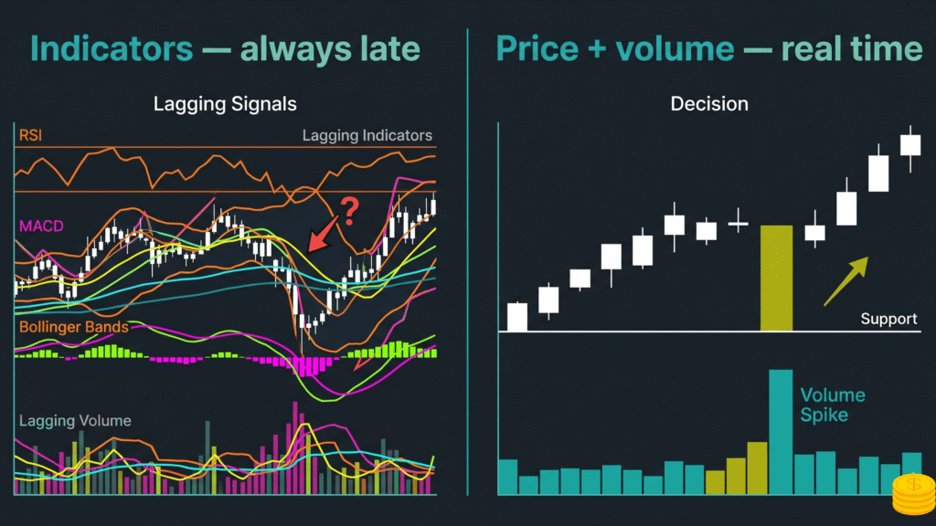
Indicators are derivatives. They’re calculated from price. Which means by the time an indicator gives you a signal, the information that created it has already happened.
Price and volume are the raw source. Every trade that occurs prints directly on the chart as a price bar. Volume tells you the force behind it. Together they reveal whether buyers or sellers are winning the battle at any given moment — before any indicator has processed the move.
The logic is simple: if a market falls 2% on heavy volume, that’s sellers overwhelming buyers. If a market falls 2% on extremely light volume, that might mean buyers have stepped away a very different situation. Same price movement. Completely different story.
This is what learning how to read price and volume in trading unlocks. And when you combine it with the position of the close inside each price bar, you gain an edge that no mechanical indicator can replicate.
According to Investopedia’s guide to technical analysis, price and volume are the two primary inputs of classical technical analysis everything else is derived from them.
The 3 raw elements every serious chart reader tracks:
- The size of the price bar (wide or narrow range)
- Where the close sits within that range (high, low, or middle)
- The volume (force of the buying or selling effort)
Master those 3 elements in context and you can read any market on any timeframe.
The Anatomy of a Single Price Bar
Before reading a sequence of bars, you need to read one bar correctly.
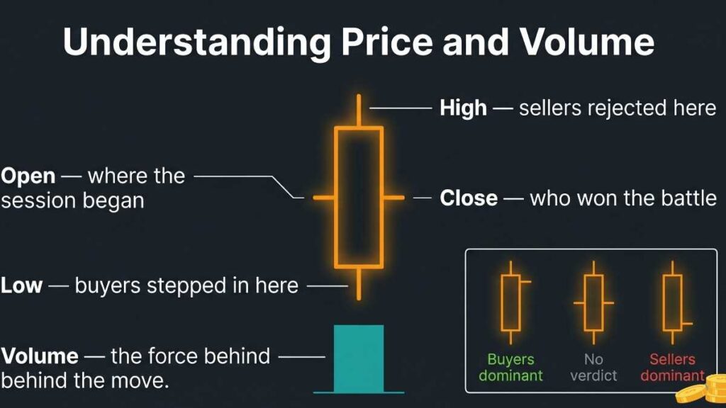
A bar chart bar has 4 data points: open, high, low, and close. The vertical line shows the full range from low to high. The left tick marks the open. The right tick marks the close.
What each element tells you:
Bar range (wide vs. narrow). A wide bar means the market moved significantly during that period. Whether it went up or down, there was decisive movement. A narrow bar means the market couldn’t commit to a direction. Either buyers and sellers were roughly matched, or both were absent.
Position of the close. This is the single most informative data point on any bar. A close near the high means buyers dominated by the end of the session they absorbed all selling and pushed price up. A close near the low means sellers remained in control. A close in the middle is ambiguous neither side won decisively.
Think of it this way: the close is the final verdict of the session’s battle. It shows who held the ground when the bell rang.
Volume. Volume is the effort. The close is the result. Comparing the two tells you whether the effort was rewarded or wasted. Heavy volume producing a wide bar in the direction of the trend = force with follow-through. Heavy volume producing a narrow bar = enormous effort going nowhere. That second situation is critical: it means one side threw everything at the market and got almost nothing for it.
How to Read Bar Charts Sequentially: The Logic Framework
Here’s where most chart reading education stops short. People learn what individual bars mean but never learn how to read them in sequence which is where the actual edge lives.
Reading bar charts sequentially means comparing each bar to the ones before it and asking: does this continue the story or change it?
A simple framework for every bar you read:
Step 1: What was the range wide or narrow? Wide bars show momentum or urgency. Narrow bars show hesitation, absorption, or exhaustion.
Step 2: Where did it close? High close = buyers in control at the end. Low close = sellers. Midrange = inconclusive.
Step 3: How did this compare to the previous bar? Did the market make progress in the expected direction? Did it fall short? Did it reverse?
Step 4: Was there follow-through? A strong bar followed by no follow-through is a warning. It means momentum stalled. A weak bar followed by a strong one in the opposite direction is a warning in the other direction.
The most important concept in sequential bar reading: follow-through.
Markets are supposed to continue in the direction of a strong move. When they don’t, something has changed. A breakout above resistance that produces a narrow bar on the next session means the breakout may have been a trap. A strong sell-off that produces a tiny inside bar on the next day means sellers may be losing conviction.
Every chart reading decision is essentially asking: is the expected follow-through happening?
The Effort vs. Reward Comparison — The Engine of Price/Volume Analysis
The most powerful concept in reading price and volume together is effort vs. reward.
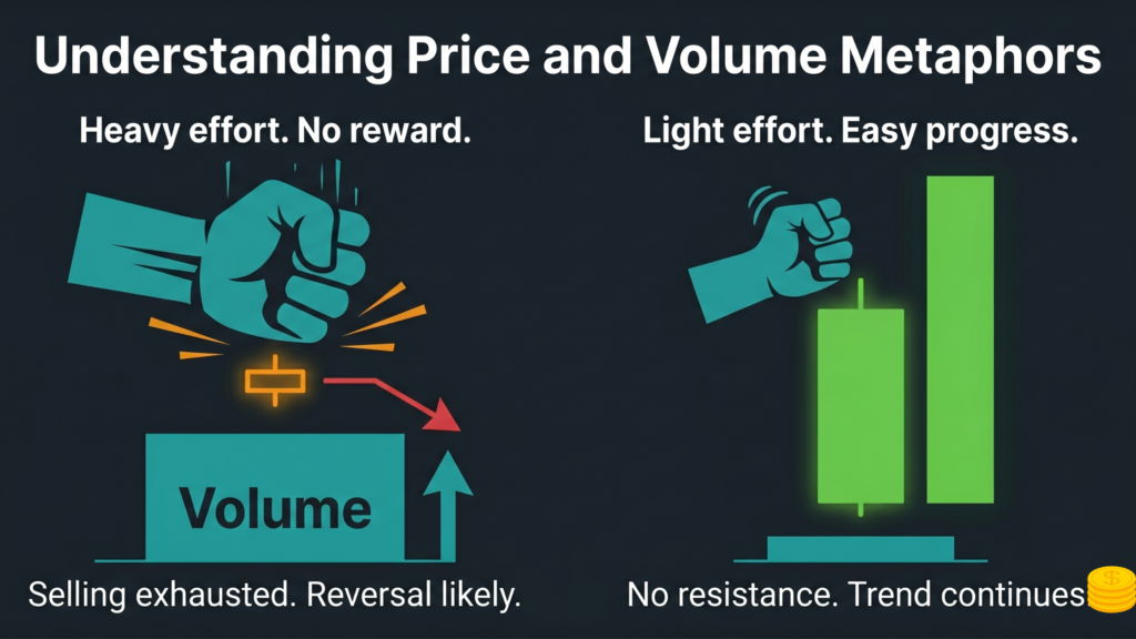
Effort = the volume (how hard the buyers or sellers pushed). Reward = the price progress achieved (did the effort produce movement?).
When effort and reward are out of proportion, pay attention. That imbalance is almost always meaningful.
Heavy effort, poor reward:
A market falls sharply on the biggest volume of the past month but closes near midrange and barely sets a new low. That’s massive selling effort tons of contracts changing hands that produced almost no downward progress. Why? Because someone was absorbing that selling. Buyers were taking all of it. This is one of the clearest signs that a low may be forming.
Light effort, good progress:
A market rallies quietly on dwindling volume and makes higher highs easily. Very little selling is present. The buyers don’t have to fight for every tick. This is a market that wants to go up and isn’t meeting resistance. It’s a very different situation from a market fighting through supply on every move.
The general table of effort vs. reward signals:
| Situation | What It Suggests |
|---|---|
| Wide bar up + heavy volume | Strong buying, trend likely continuing |
| Narrow bar up + heavy volume | Buying absorbed by supply, caution |
| Wide bar down + heavy volume | Strong selling, trend likely continuing |
| Narrow bar down + heavy volume | Selling absorbed by demand, potential reversal |
| Narrow bar + low volume in trend | Resting, not changing direction yet |
| Narrow bar + low volume at support | Sellers exhausted, potential spring forming |
| Wide bar reversal + heavy volume | Climactic action, potential trend change |
No single bar makes a case by itself. These signals build their meaning from context — the trend, the nearby support/resistance levels, and the sequence of bars preceding them.
How Drawing Lines Transforms Chart Reading
You can read individual bars and still miss the forest for the trees. The lines are what give each bar its context.
Support and resistance lines frame trading ranges. Trend lines capture the angle of advance or decline. Channels show the expected boundaries of a move. Without them, you’re evaluating every bar in a vacuum.
With them, every bar has a location. You know if price is approaching resistance, bouncing off support, breaking out of a range, or failing to follow through after a breakout. The bar’s behavior at those levels is the story.
The axis line concept. One of the most useful phenomena in chart reading is that old support often becomes resistance, and old resistance often becomes support. A level where price found buyers in October may be the exact level where sellers emerge in March. These levels switch roles repeatedly. Traders who draw them and watch price behavior around them have a massive advantage over those reading raw bars without context.
Trend channels. A normal up-channel is drawn by connecting rising lows (the demand line) and placing a parallel line across an intervening high (the supply line). When price exceeds the supply line, it signals an overbought condition often more reliable than any mathematical overbought indicator. When price falls below the demand line, the uptrend is under pressure.
Price behavior at these boundaries is where the trading signals emerge. A rally to the supply line that produces a narrow bar with a weak close? Sellers are at the wall. A sell-off to the demand line that reverses with a strong close on decent volume? Buyers defended the level.
Confluence zones. Sometimes a trend line, a support/resistance level, and a channel boundary all converge at the same price level. When three or more lines point to the same area, pay close attention. These confluence zones produce some of the highest-probability turning points on any chart.
What Narrow Ranges Actually Mean (Most Traders Get This Wrong)
Narrow range bars are widely misread. Most traders dismiss them as “nothing happening.” In reality, narrow ranges are some of the most informative bars on a chart.
Narrow range + low volume in the middle of a trend: Resting. The trend is pausing but not reversing. Not the time to take a countertrend position.
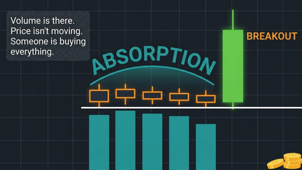
Narrow range + high volume at a key level: This is the critical one. If the market has enormous volume but barely moves, it means one side is absorbing everything the other side is throwing at it. Big money doesn’t reveal itself on wild moves — it hides in narrow ranges where volume is heavy. The market moves little because as fast as sellers sell, buyers are absorbing every contract. Or vice versa at a top.
Narrow range after a strong move: If the market makes a powerful move and then goes narrow with dwindling volume, it’s testing whether there’s opposition. If no one pushes back, the trend continues. If sellers (or buyers) step in strongly on the next bar, the narrow range was a warning of reversal.
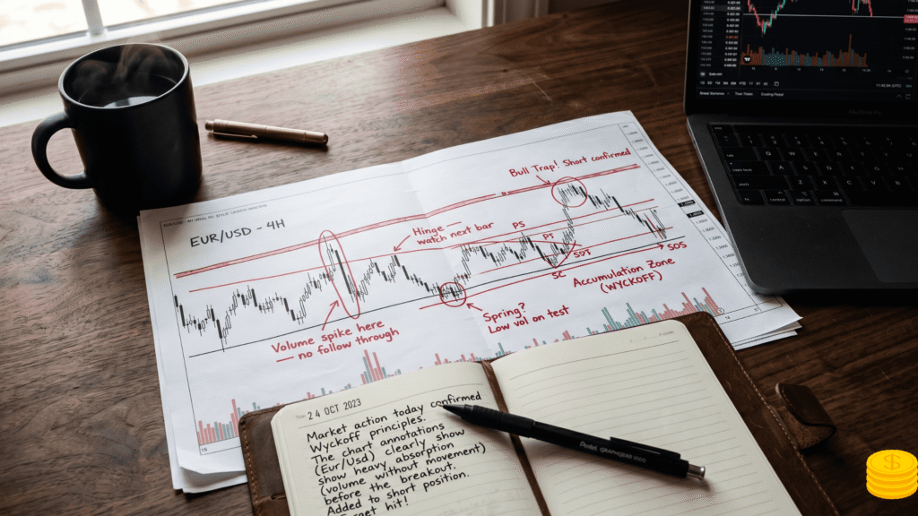
A hinge. When prices contract to a tiny range the market at dead center it’s often the last moment of equilibrium before a significant move. Wyckoff traders call this a hinge. The price behavior on the next bar usually reveals direction. A hinge after a bullish setup is a signal to be ready to buy. A hinge after a bearish sequence means watch for a breakdown.
The practical rule: never ignore a narrow range bar. It’s either restful a brief pause before continuation or it’s absorptive, signaling a major battle at a key level. Context tells you which.
Springs: How Professionals Buy at the Exact Moment Retail Traders Panic
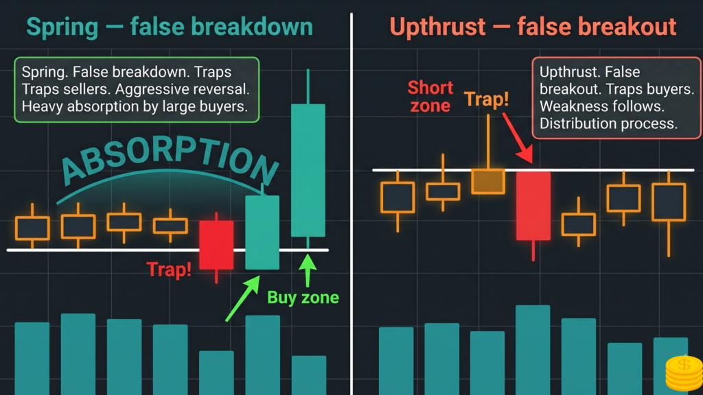
A spring is one of the most powerful setups in all of technical trading. It’s also one of the most poorly understood.
A spring occurs when price breaks below a well-defined support level or the lower boundary of a trading range and then fails to follow through. Instead of continuing lower, price reverses back into the range.
Why is this significant? Because when price breaks below support, the conventional wisdom says to get out. Stops are hit. Weak holders are shaken out. Short sellers pile in expecting a continued move lower. And right at that moment when the selling pressure is maximum the buyers absorb it all and push back.
The boxer knocked out of the ring who immediately climbs back in and lands a haymaker.
What makes a valid spring:
- A clearly defined support level (not an arbitrary line, but a level price has interacted with multiple times)
- A penetration below that level (the break)
- A failure to follow through (little or no ease of downward movement after the break)
- A reversal back above the broken support, ideally on strong volume
Volume context matters. Springs can occur on either heavy or light volume. A heavy-volume spring means a large selling effort was completely absorbed by buyers very bullish. A low-volume spring means the sellers didn’t even show up supply is exhausted and the selling pressure is spent. Both can lead to strong moves.
The secondary test. After a spring, price often pulls back to test whether the low holds. This secondary test where price approaches the spring low again on lower volume and narrower range is often the cleaner, lower-risk entry point. The spring established the low. The secondary test confirms it.
Springs in uptrends vs. downtrends. A spring within an established uptrend has a high probability of working. The trend is on your side. A spring in a downtrend what experienced traders call a “bottom picker’s nightmare” often fails. These failed springs produce fast, sharp bounces that reverse and continue lower. Until the larger downtrend has shown signs of exhaustion, approach springs in downtrends with extreme caution.
Upthrusts: The Exact Opposite and Equally Powerful
If a spring is a false breakdown that leads to a rally, an upthrust is a false breakout above resistance that leads to a decline.
When price surges above a well-defined resistance level and then fails to hold reversing back into the range that’s an upthrust. It’s the market’s way of clearing out weak shorts and attracting breakout buyers at the worst possible moment.
Signs of a valid upthrust:
- A clearly defined resistance level tested multiple times
- A breakout above that level
- Narrow range, weak close, or rapid reversal within 1-3 bars of the breakout
- Subsequent session erases most or all of the breakout gains
A narrow range breakout price clears resistance but barely moves and closes weakly is one of the most reliable upthrust signals. It means demand is not aggressive enough to push through the supply sitting above. The professional sellers are offloading into the excitement of the breakout.
The immediate test: After a breakout, watch the next 2-3 sessions closely. Does volume expand with follow-through? Or does the range narrow and price drift back below the breakout level? The latter confirms the upthrust. The most bearish scenario is when the session immediately following the “breakout” produces the largest down-bar in several weeks on heavy volume sellers weren’t just holding; they were waiting to sell into exactly that moment.
Shortening of the Thrust: Reading Trend Exhaustion Before It Happens
One of the most underrated signals in price/volume analysis is shortening of the thrust (SOT). It shows up at the end of both uptrends and downtrends, and it tells you a trend is losing momentum before most traders realize it.
Here’s how it works in a downtrend. Price makes a low at $50. Then rallies. Then falls to $46 a 4-point move. Rallies again. Then falls to $44 a 2-point move. Then $43.50 less than a 1-point move.
Each successive downswing covers less ground than the last. The bears are pushing but they’re getting weaker with every wave. Combine this with volume that’s also diminishing on each downswing, and you have a market whose selling pressure is draining away. A reversal a spring often follows.
The same pattern works in reverse at uptrend tops. Each successive up-wave covers less distance than the last. The bulls are pushing but getting weaker. The market runs out of buying force before it runs out of technical space.
Watch for shortening of the thrust:
- Measure the price distance covered on each swing in the trend direction
- If successive swings are covering progressively less ground, the thrust is shortening
- Confirm with volume: if volume is also diminishing on each successive wave, the trend is exhausted
- Watch for a potential spring (in a downtrend) or upthrust (in an uptrend) to set up next
This is one of the reasons experienced chart readers rarely get caught on the wrong side of a major reversal. The clues accumulate bar by bar, swing by swing, before the reversal completes.
How to Apply This to Your Own Chart Reading: A Daily Practice
Understanding these concepts intellectually and applying them in real time are different skills. The gap between them closes through deliberate daily practice.
A practical daily chart reading routine:
- Start with the weekly chart. Identify the primary trend. Are we above or below a 10-week moving average? Are highs and lows stepping higher or lower? Draw the major support, resistance, trend lines, and channels. This is your map.
- Step down to the daily chart. Frame the current trading range. Draw horizontal support and resistance lines across recent significant highs and lows. Note any confluence zones where multiple lines converge.
- Read the last 5-10 bars sequentially. For each bar: what was the range (wide/narrow)? Where did it close (high/low/mid)? What was volume doing? Is there effort-reward alignment or imbalance?
- Look for a story. Are sellers failing to make progress below support? Is a potential spring developing? Are breakout bars narrow with weak closes an upthrust in progress? Is the thrust shortening on successive swings?
- Define the scenario and what would confirm it. If you think a spring is developing: what price level, what bar behavior, and what volume would confirm the reversal? Set that as your trigger. Trade the confirmation, not the anticipation.
The one habit that accelerates everything: keep a chart reading journal. Print or save 3-5 charts per day and annotate them with your observations. After a week, review what you missed and what you read correctly. Pattern recognition in charts is built through repetition. There is no shortcut.
Price and Volume Across Different Timeframes
The principles don’t change across timeframes only the magnitude and duration of the signals.
A spring on a monthly chart may take 6 months to fully resolve. A spring on a 5-minute chart might produce a trade lasting 20 minutes. The bar-by-bar reading logic, the effort vs. reward analysis, the close position interpretation all identical.
Why longer timeframes matter even for short-term traders. A trader shorting what looks like an upthrust on a daily chart may be fighting a spring that just formed on the monthly chart. The monthly trend has more power. Short-term traders who understand longer-term context avoid fighting the larger trend.
The practical approach: always check one timeframe higher than the one you’re trading. If you trade daily charts, check the weekly. If you trade hourly charts, check the daily. The higher-timeframe story gives context that makes the lower-timeframe signals much more reliable.
The universal hierarchy:
- Monthly and quarterly charts: the map. Long-term support, resistance, and trend direction.
- Weekly charts: the regional guide. Where major trading ranges and reversals are clearest.
- Daily charts: operational decisions. Where most swing trade setups are identified.
- Intraday charts (60-min, 15-min, 5-min): execution. Where the entry is triggered and the stop placed.
Common Chart Reading Mistakes and How to Fix Them
Reacting to one bar instead of reading the sequence. A single strong bar doesn’t make a trade. The context of the preceding 10-20 bars determines whether that strong bar is a genuine signal or a false move. Always read sequences, not isolated signals.
Ignoring where the close sits within the range. Traders track open and close but forget to think about where the close sits within the bar’s full range. A bar that closes at the same price as yesterday’s close can still be very bullish (if the range was huge and the close is near the high) or very bearish (if the close is near the low of a range that swept way above the open). Position within range matters enormously.
Treating every volume spike as climactic. Heavy volume is not always climactic action. In the early stages of a strong uptrend, breakouts often occur on heavy volume as part of a healthy impulse move. Volume only becomes climactic when it’s combined with a reversal or a failure to follow through. Context makes the difference.
Forgetting the trend. A potential spring setup in a strong downtrend is far less likely to work than the same setup in an established uptrend. The trend is the most powerful filter for any signal. When you’re reading against the trend, the burden of proof is higher.
Over-drawing lines until the chart becomes a mess. More lines are not better. The most important lines are the ones price has interacted with multiple times where the market repeatedly showed up to buy or sell. Start with the highest-volume reversal points and extend those lines forward. Clarity beats completeness.
FAQ: Reading Price and Volume in Trading
What does volume tell you in trading that price alone doesn’t?
Volume tells you about the force behind a price move. Two price bars can show the same range and close, but if one had 10x the volume of the other, the stories are completely different. High-volume price action means large numbers of contracts changed hands institutional involvement. Low-volume price action reflects retail-level activity with little conviction. Volume also reveals effort-reward imbalances that signal potential reversals before price confirms them.
How do you know if a breakout is real or a false move?
Watch the bar that breaks out and the 2-3 bars immediately following it. A genuine breakout expands in range, has good volume, closes strongly in the direction of the break, and follows through in subsequent sessions. A false breakout (spring or upthrust) typically produces a narrow-range breakout bar, fails to close strongly, and often reverses sharply within 1-3 bars, erasing all the gains (or losses) from the breakout.
What does a close near the low of a bar mean?
The close near the low means sellers controlled the session through to the end. Despite any intraday rally attempts, sellers finished the session in command. In a downtrend, a series of closes near the low reinforces that trend. In an uptrend, a sudden close near the low is a warning it may not reverse the trend, but it signals sellers are gaining influence.
How long does it take to become proficient at reading bar charts?
With deliberate daily practice reading 3-5 charts per day, annotating them, and reviewing your analysis the next day most traders see meaningful improvement in 3-6 months. Proficiency at reading unusual situations and confluence signals takes longer, often 12-18 months of consistent practice. There is no shortcut: the skill is built through repetition of the same observation process applied to hundreds of different market situations.
Can this approach work for crypto and forex, or just stocks?
Price and volume analysis works on any liquid market where volume data is available. It’s applied to stocks, futures, forex, commodities, and crypto. The only caveat on forex: volume data in forex is tick volume (number of price changes), not actual contract volume. Tick volume correlates well with actual volume in liquid pairs but is not identical. Futures traders have access to actual exchange volume, which gives the clearest signals.
What’s the first thing to look at when you open a chart?
Identify the dominant trend direction from the weekly chart, then locate the nearest significant support/resistance level to current price. Those two pieces of information give you the context needed to interpret every individual bar. Without them, you’re reading in a vacuum.
The Road From Reading Charts to Trading Charts
Reading charts correctly is not the same as trading them profitably. The reading skill removes the guesswork about what the market is doing. Turning that reading into consistent trades requires two additional things: a defined entry trigger and a defined risk level.
The entry trigger comes from the confirmation bar. After a potential spring forms, wait for the bar that closes back above the support level ideally on widening range and improving volume. That’s the confirmation. Entries before that confirmation expose you to getting trapped on the wrong side of a continued breakdown.
The risk level is the low of the spring, the high of the upthrust, or the relevant reversal point. If price moves decisively beyond that level, the reading was wrong and the position should be closed. This is why reading price and volume is also a risk management tool the signals give you a clear point beyond which the setup has failed.
Start by reading charts without trading them. One week of deliberate chart reading practice no trades, just observation does more for most traders than a month of reactive trading. See the setups form. Identify where the spring low was. Watch whether the secondary test holds. Let the patterns become familiar before money is on the line.
The market tells you what it’s doing. Price and volume are the language. This guide is the grammar lesson.
2 thoughts on “How to Read Price and Volume in Trading: The Bar Chart Method That Changes Everything”