
Quick answer
Blue ocean strategy for Investors is a business framework for finding uncontested market space instead of fighting competitors head-on. For investors, it’s a useful lens for judging whether a company actually has room to grow or is just fighting harder for the same shrinking slice of a crowded market. The two tools worth stealing from the framework: the strategy canvas, which maps how every company in an industry competes on the same handful of factors, and the four actions grid (eliminate, reduce, raise, create), which tests whether a company is genuinely doing something different or just offering a bit more for a bit less.
| Signal | Red ocean company | Blue ocean company |
|---|---|---|
| Competing on | Price, features, marketing spend | A redefined problem or new customer group |
| Growth source | Taking share from rivals | Growing the total market |
| Value curve | Matches competitors closely | Looks genuinely different when plotted |
| Margins | Under constant pressure | Often protected, at least for a while |
| Investor risk | Commoditization, price wars | Story might be ahead of the financials |
Every industry has a version of the same argument: which company has the best product, the lowest price, or the strongest brand. Blue ocean strategy, a framework built by two business school researchers, argues that question is often the wrong one. The companies that generate outsized returns usually aren’t winning that argument. They’ve stopped playing that game entirely.
This matters for investors because it’s a genuinely useful filter. Most companies you’ll ever research are competing in a “red ocean,” a crowded market where everyone fights over the same customers using the same handful of levers: price, quality, service, marketing. A smaller number have found or built a “blue ocean,” uncontested space where the usual competitive pressure barely applies, at least for a while. Telling the two apart before you invest, rather than after the stock has already re-rated, is the actual skill here.
Red ocean vs blue ocean, in plain terms
A red ocean is any market defined by existing boundaries and existing rules. Everyone in it is measured against everyone else on the same factors, which is why prices get squeezed and margins compress over time. The name comes from the bloodied water of competitors fighting over a shrinking catch.
A blue ocean is market space that doesn’t really exist yet, created by a company that redefined the problem it’s solving rather than trying to out-execute rivals on the existing one. There’s little or no competition because the space is new, which usually means better margins, faster growth, and pricing power that a red ocean competitor simply doesn’t have.
Neither state is permanent. Blue oceans attract competitors over time and gradually turn red. Red oceans occasionally get disrupted by a company willing to redefine the rules. The investor’s job isn’t to find a permanent blue ocean, since those don’t exist, it’s to find companies currently swimming in one, and to have a rough sense of how long that water stays blue.
The strategy canvas: mapping how an industry actually competes
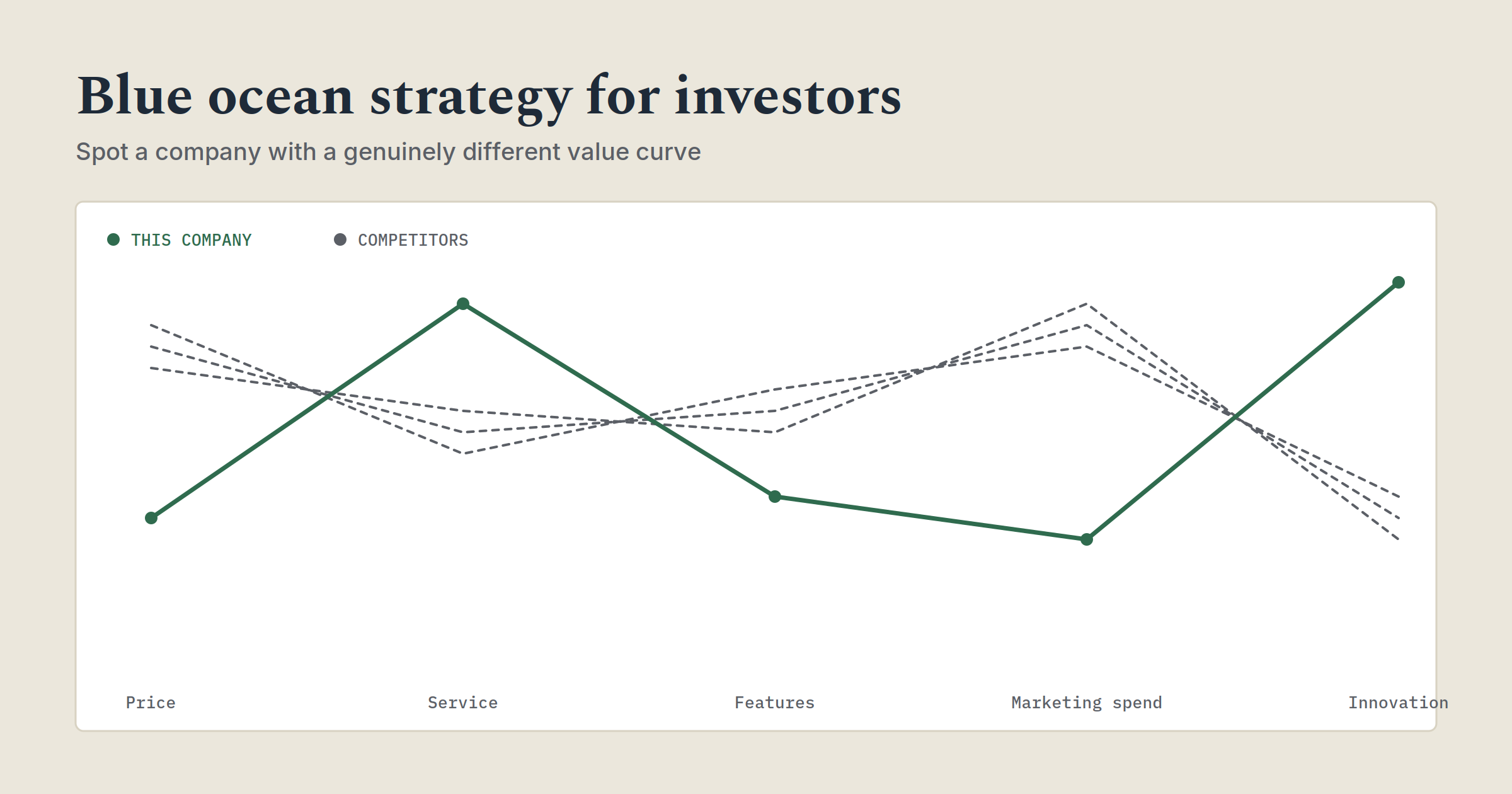
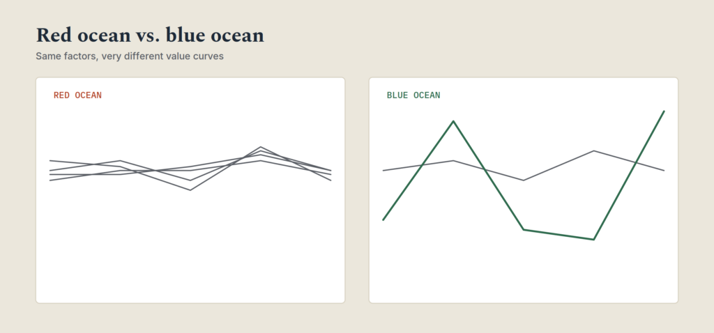
The strategy canvas is a simple diagnostic tool. Down one axis, you list every factor an industry competes on: price, service quality, brand prestige, product range, whatever the market actually cares about. Across the other axis, you plot how much each company invests in or delivers on each factor. The resulting lines are called value curves, and they reveal something most investors never actually check: how similar the competitors in a “competitive” industry usually are.
Take the U.S. wine industry in the late 1990s. More than 1,600 wineries competed on roughly the same seven factors: price, elite packaging and vineyard prestige, marketing spend, aging quality, tasting complexity, and range. When you actually plotted them, premium wineries all had nearly identical value curves, just a high one. Budget wineries had nearly identical curves too, just a low one. Despite the sheer number of competitors, there were really only two strategic groups, and every company inside each group looked the same to the buyer.
That’s the pattern worth hunting for as an investor. Pick any industry you’re researching and sketch a rough strategy canvas yourself: what does this company actually compete on, and does its value curve look meaningfully different from its five biggest competitors, or does it just sit a little higher or lower on the same shape? A company that’s simply offering a bit more for a bit less is playing the red ocean game, even if its marketing says otherwise. A company whose value curve looks genuinely different, that’s raised some factors, dropped others entirely, and added something the rest of the industry doesn’t offer, is the one worth a second look.
One winery did exactly that. Casella Wines, an Australian producer, looked past its wine industry rivals and studied beer and ready-to-drink cocktails instead, categories that captured three times more of the U.S. alcohol market than wine did. It found that most American adults found wine intimidating and overcomplicated, exactly the qualities the rest of the industry was competing to maximize. Casella dropped the vineyard prestige, the aging pedigree, and the tasting complexity almost entirely, and built a wine, [yellow tail], that was easy to drink and simple to choose. Within two years it became the top-selling imported wine in the United States and grew the overall wine-drinking market rather than just stealing share from other labels.
The four actions grid: eliminate, reduce, raise, create
This is the practical checklist version of the strategy canvas, and it’s the part worth actually running against any stock you’re evaluating.
| Question | What it tests |
|---|---|
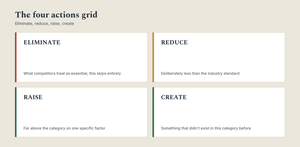
| Eliminate: what factors does this company skip entirely that its competitors treat as essential? | Whether it’s genuinely rethinking the business or just trimming costs |
| Reduce: what does it deliberately do less of than the industry standard? | Whether it’s cutting things customers don’t actually value, not just cutting corners |
| Raise: what does it do far better than anyone else in the category? | Whether there’s a real, defensible strength, not just marginal improvement |
| Create: what does it offer that didn’t exist in this category before? | Whether it’s expanding the market or just fighting for the current one |
A company that can give you a specific, concrete answer to all four questions is showing real strategic differentiation. A company that can only answer “raise,” meaning it just claims to do the existing things better, is very likely still in a red ocean, no matter how its investor deck frames it.
NetJets is a useful case for this one, partly because Berkshire Hathaway bought it in 1998 and it’s been a long-term holding since. Corporate travelers had two real choices before NetJets: fly commercial first class, or buy a private jet outright, an asset most companies couldn’t justify. NetJets eliminated full aircraft ownership entirely, reduced the cost and hassle relative to buying a jet, raised reliability and flexibility relative to commercial travel, and created a new category, fractional jet ownership, that didn’t meaningfully exist before. It didn’t win by being a slightly better airline or a slightly cheaper private jet dealer. It made both comparisons irrelevant.
How to tell a real blue ocean from a good story
This is where investors need to be more skeptical than most business books encourage you to be. Plenty of companies borrow the language of value innovation, disruption, category creation, without the underlying substance. Being able to spot the difference protects you from paying a growth-stock premium for what’s actually a red ocean company with a good marketing team.
| Real blue ocean signal | Red ocean dressed up as one |
|---|---|
| Revenue growth is coming from new customers, not just share taken from rivals | Growth is explained almost entirely by market share gains in a flat or shrinking market |
| Margins are stable or expanding as the company scales | Margins compress as competitors respond, despite the “unique” positioning |
| The company can name what it eliminated or reduced, specifically | The pitch only ever talks about what it does more of or better |
| Competitors are slow to respond because the category itself is new | Competitors respond quickly, because it’s really just a better version of an existing product |
| Pricing power holds even as the company grows | Growth requires increasing discounts or spending to defend share |
The financials are the tiebreaker here, not the pitch. A genuine blue ocean tends to show up in the numbers as expanding or stable margins alongside real revenue growth, since the company isn’t spending itself into the ground defending share against direct competitors. If a company’s story sounds like value innovation but its margins are under the same pressure as everyone else in its sector, the strategy canvas probably looks more similar to competitors than the narrative suggests.
Six places to look for a company’s real competition
Most investors define a company’s competitors the same way the company itself does: whoever else sits in the same industry category. Blue ocean strategy argues that’s usually too narrow a view, both for the company building the strategy and for the investor trying to evaluate it. Six places are worth checking before you decide who a company is actually up against.
Alternative industries. Products with different forms that serve the same underlying purpose. A streaming service doesn’t only compete with other streaming services, it competes for the same evening hours as a video game, a gym class, or a book. If a company’s real competition is an entirely different category of spending, its addressable market and its risk profile look nothing like what a same-industry comparison would suggest.
Strategic groups within the industry. Most industries split into a few clear tiers, budget, mid-range, premium, and companies mostly benchmark others in their own tier. A company that deliberately straddles two tiers, offering premium quality at a mid-range price or vice versa, is often doing something structurally different rather than just competing harder within its assigned group.
Buyer groups. Many purchases involve three different people: the one who pays, the one who uses the product, and the one who influences the decision. Most companies in an industry target the same one of these three. A company that shifts focus to a different buyer group entirely, selling to the end user in a market where everyone else sells to procurement, for instance, can end up with a very different growth trajectory than its peers.
Complementary products and services. Look at what happens right before and right after a customer uses this product. Often there’s friction, cost, or hassle in that surrounding experience that the core industry has simply learned to ignore. A company that solves for the whole experience rather than just its own narrow product slice can capture value competitors aren’t even looking for.
Functional vs. emotional positioning. Some industries compete on function (does it work, is it efficient), others on emotion (how does it make the buyer feel). A company that successfully flips an industry from one orientation to the other is often tapping into a customer base the rest of the industry has never seriously targeted.
Time. What trend is currently reshaping how customers behave, and is this company positioned ahead of that shift or still built around the world as it existed five years ago? This is less about predicting the future and more about noticing a trend that’s already underway but hasn’t fully played out in the company’s sector yet.
Running a company through these six questions takes longer than glancing at its 10-K’s competitor list, but it usually surfaces a more accurate picture of where the real risk and the real opportunity sit. A company that only makes sense when compared to its obvious, same-category peers is telling you it’s playing a fairly conventional game. A company whose best comparison sits in a completely different category is often the one actually worth the closer look.
A real example, and what the numbers actually say
Case studies are more convincing with real numbers attached, and most business books, this framework’s original included, stop at the story. Here’s what the pattern looks like when you follow the financials of an actual public company through it.
Celsius Holdings entered the U.S. beverage market against Red Bull and Monster, two entrenched, well-funded incumbents competing almost entirely on flavor, price, and marketing spend, textbook red ocean. Instead of competing on those same factors, Celsius reduced the sugar and additive-heavy formula the category was built on and raised the fitness-and-wellness positioning most energy drinks never touched, marketing itself as a workout companion rather than an energy hit. That’s an eliminate-reduce-raise-create case running in real time, not a decades-old textbook example.
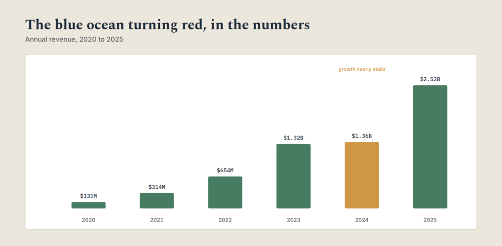
| Year | Annual revenue | YoY growth | What was happening |
|---|---|---|---|
| 2020 | $130.7M | +74% | Early growth, still a small niche player |
| 2021 | $314.3M | +140% | Category positioning taking hold |
| 2022 | $653.6M | +108% | PepsiCo distribution partnership begins |
| 2023 | $1.32B | +102% | Gross margin expands to 48.8% (from 38.5% a year earlier) |
| 2024 | $1.36B | +2.9% | Growth stalls, net margin falls to 7.9% from 14% |
| 2025 | $2.52B | +85.5% | Re-accelerates after acquiring Alani Nutrition |
The 2024 stall is the instructive part, and it’s exactly the pattern this article warned about earlier: every uncontested space eventually attracts competition. As rivals launched their own zero-sugar, fitness-angled competitors and a distributor transition created inventory problems, growth nearly flattened and margin compressed hard in a single year. The blue ocean had started turning red. The 2025 re-acceleration came from expanding the water again through acquisition rather than from the original positioning alone, a reminder that even a genuine blue ocean isn’t a strategy you execute once and hold forever.
For an investor watching this in real time rather than after the fact, the signal was in the margin line, not the headlines. Revenue growth alone in 2022 and 2023 could have been mistaken for simple market share gains. The 2023 gross margin expansion alongside that growth was the confirmation that pricing power was real, and the 2024 compression was the first hard evidence that the water was no longer as uncontested as it had been.
The buyer utility map: a second lens most guides skip
The strategy canvas and the four actions grid get most of the attention, but there’s a third tool worth knowing, and it’s the one almost no investor-facing write-up of this framework actually covers.
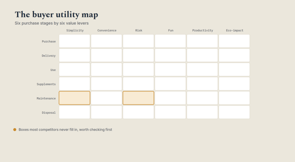
The buyer utility map crosses two lists. Down one side, the stages a customer actually goes through around a purchase: buying it, having it delivered, using it, needing supplements or add-ons for it, maintaining it, and eventually disposing of it or replacing it. Across the other side, six things that create value at each stage: how much it simplifies the customer’s life, how convenient it is, what risk it removes, how fun or good it feels to use, and how environmentally sound it is.
Most companies in a given industry cluster their value around the same one or two boxes in that grid, usually “use” and “buying,” because that’s where the whole industry has always focused attention. The unexplored boxes, often maintenance, disposal, or the risk dimension, are where a lot of quieter differentiation actually happens.
For an investor, this is a fast way to sanity-check a company’s “we’re different” story. If a company claims differentiation but sits in the exact same box as its competitors when you actually map it out, that’s a red flag the strategy canvas alone might not catch as quickly. A company genuinely serving an unaddressed box, cutting the hassle out of maintenance in an industry where nobody else bothers, say, is showing the kind of structural difference that’s harder for a competitor to copy overnight.
You don’t need to fill in all 36 boxes for every stock you look at. Even a rough pass, asking which one or two boxes this company is winning that its closest competitor isn’t touching, takes a few minutes and often reveals whether a differentiation claim is real or just marketing language.
A tool worth running before you commit
Everything above works better run in sequence than read once and forgotten. A quick self-check, based on the four actions grid plus the two financial confirmation signals from earlier in this article, is worth applying to any stock currently being pitched to you as disruptive or category-defining.
Blue Ocean Scorecard
Answer six questions about a company you’re researching. Be honest rather than generous, the point is to catch a weak story before your portfolio does.
Common mistakes when applying this to stock picking
Treating “disruptive” as a synonym for “investable.” Plenty of genuinely disruptive companies never turn a profit, or take a decade longer to do so than early investors expected. A real blue ocean is necessary for outsized returns, but it isn’t sufficient on its own. You still need the balance sheet and the execution to hold up.
Confusing a temporary blue ocean with a permanent one. Every uncontested market space eventually attracts competition. Part of the research is estimating how wide the moat is and how long it holds, not just confirming the moat exists today. A blue ocean with no real barrier to entry turns red fast.
Skipping the strategy canvas and just trusting management’s framing. Every company’s investor presentation claims some form of differentiation. Actually sketching out the competing factors and where the company sits relative to peers takes twenty minutes and catches a lot of stories that don’t hold up once you plot them.
Ignoring the financial confirmation. A compelling value innovation story with margins that are still compressing under competitive pressure is a red flag, not a rounding error. The framework is a lens for asking better questions, not a replacement for reading the income statement.
Frequently asked questions
Is blue ocean strategy the same thing as a competitive moat?
They overlap but aren’t identical. A moat, in investing terms, is usually about defensibility, why competitors can’t easily copy what a company does. Blue ocean strategy is motre about the initial positioning, why a company isn’t playing the same competitive game as its peers in the first place. A strong blue ocean position often creates a moat, but the two ideas emphasize different things.
Can a blue ocean company become a red ocean investment over time?
Yes, and it happens often. As a category matures and competitors catch on, the uncontested space narrows and the company starts competing more directly on price and features like everyone else. Watching margin trends over several years is one of the more reliable ways to catch this shift as it happens, rather than after the stock has already repriced.
Does this framework work for evaluating small companies as well as large ones?
It applies at any size, arguably more usefully for smaller companies, since a strategy canvas comparison against five bigger, better-funded competitors is exactly the kind of analysis that can reveal whether a smaller company has genuine differentiation or is just under-resourced competition in the same red ocean.
How is this different from a standard SWOT analysis?
A SWOT analysis catalogs a company’s strengths, weaknesses, opportunities, and threats in isolation. The strategy canvas specifically plots a company against its competitors on the same shared factors, which makes it easier to see convergence, everyone actually offering some version of the same thing, that a SWOT analysis alone often misses.
Putting it together
None of this replaces reading a balance sheet, checking a valuation, or understanding a company’s actual growth drivers. What it adds is a sharper question to ask before any of that: is this company genuinely doing something different, or is it just a slightly better version of everyone else in its industry with a good investor deck?
Next time you’re researching a stock that’s being pitched as disruptive or category-defining, try sketching its strategy canvas against three or four direct competitors before you look at a single valuation multiple. If the value curves look nearly identical, you’re looking at a red ocean company regardless of what the pitch says. If they genuinely diverge, and the margins back it up, you may have found something worth researching further.
About the Author — Jamaluddin K.A.
Jamaluddin is the founder of The First Time Investor, a US and UK-focused personal finance and investing education site. He covers stock market fundamentals, risk management, and trading strategy for people who want to invest confidently without a finance degree.
Disclosure: This article is for educational purposes only and does not constitute financial advice. Trading on margin involves significant risk, including the potential loss of more money than initially invested. Consult a licensed financial advisor before making investment decisions.