
Quick answer
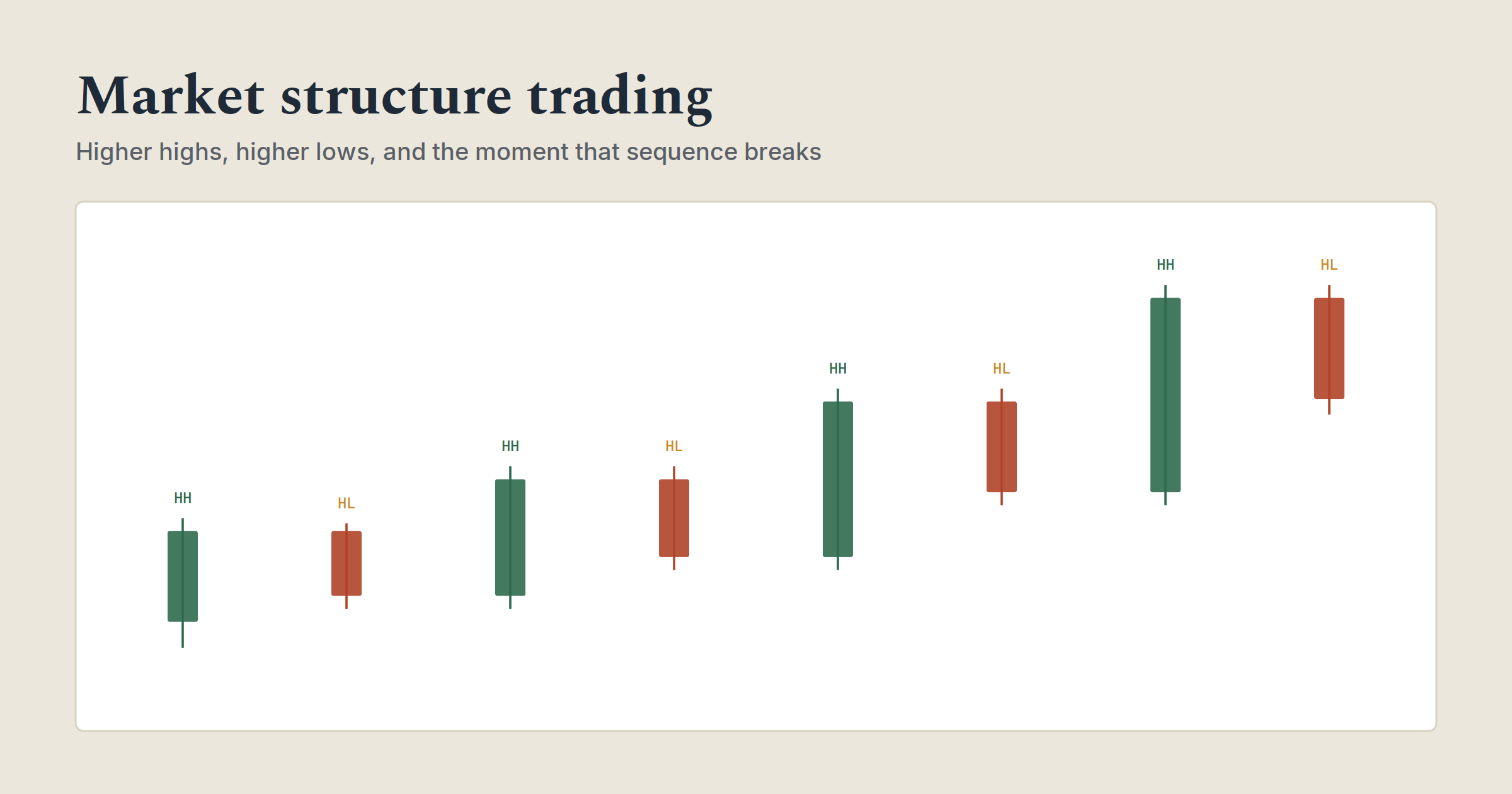
Market structure trading is the sequence of highs and lows a price makes over time, and it’s the single most reliable way to define a trend without an indicator. An uptrend is a series of higher highs and higher lows. A downtrend is a series of lower highs and lower lows. A range is neither, price bouncing between a ceiling and a floor with no new extremes in either direction. The moment that sequence breaks, a higher high fails to appear, or a higher low gets taken out, is the first objective signal that control of the market may be shifting.
| Structure | What it looks like | What it tells you |
|---|---|---|
| Uptrend | Higher highs, higher lows | Buyers in control; look for entries on pullbacks |
| Downtrend | Lower highs, lower lows | Sellers in control; look for entries on rallies |
| Range | Flat highs and lows, no new extremes | No clear direction; buy the floor, sell the ceiling |
| Break of structure | A new high or low prints in the trend’s existing direction | Confirms the trend is continuing |
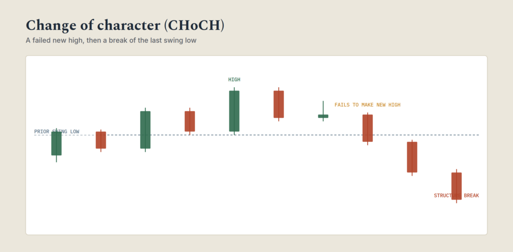
| Change of character | The trend fails to make a new high or low and reverses through the prior swing point | Early warning the trend may be turning |
Most beginners learn to define a trend by staring at a chart and deciding, by feel, whether it’s “going up.” That works until price stops cooperating, and then the feeling-based read falls apart exactly when it matters most. Market structure replaces the feeling with a rule: track the sequence of swing highs and swing lows, and let that sequence, not your impression of the chart, tell you what the trend is actually doing.
This is one of the oldest ideas in technical analysis. Charles Dow, a financial journalist and co-founder of the Wall Street Journal, laid out the foundation in a series of editorials in the late 1890s, principles that later became known as Dow Theory. The core claim, that a trend is defined by its pattern of successive highs and lows rather than by any single price level, is over a century old and still forms the backbone of how modern traders read a chart, even when they’ve never heard Dow’s name. Modern retail trading education talks about “break of structure” and “change of character” as if they were newly discovered. They’re the same idea Dow was describing, just with newer labels. Both the old language and the new language are covered here, because knowing both means you can read an old textbook and a modern trading Discord and recognize they’re saying the same thing.
What market structure actually is
Market structure is nothing more than the pattern formed by a price’s swing highs and swing lows, read in sequence. A swing high is a peak with lower price action on both sides of it. A swing low is a trough with higher price action on both sides. Connect them in the order they occur, and the shape that emerges is the structure.
That’s the entire foundation. Everything else, trend direction, reversal signals, entry timing, is built on correctly reading this sequence and reacting to how it changes.
How to define an uptrend using structure
An uptrend is confirmed by exactly one condition: each new swing high sits above the previous swing high, and each new swing low sits above the previous swing low. Higher highs, higher lows, in that order, repeated.
The underlying logic is straightforward: for a swing high to exceed the last one, buyers had to be willing to pay more than the previous peak price to keep pushing higher, meaning genuine buying pressure exceeded selling pressure over that stretch. For the pullback that follows to hold above the prior low, sellers weren’t able to push price back down to where the last swing low occurred, meaning buyers stepped back in before that level was reached.
Once an uptrend is confirmed this way, the practical goal shifts to finding entries on the pullbacks, the higher lows, rather than chasing the new highs themselves. A pullback that holds above the prior swing low and then resumes higher is the structure doing exactly what it’s supposed to do.
How to define a downtrend using structure
A downtrend is the mirror image: each new swing low sits below the previous swing low, and each new swing high sits below the previous swing high. Lower lows, lower highs.
The same logic applies in reverse. For a new low to form, sellers were willing to accept a lower price than the last low to keep pressing the decline, meaning selling pressure exceeded buying pressure. For the bounce that follows to fail below the prior high, buyers weren’t able to push price back up to the previous peak before sellers resumed control.
In a confirmed downtrend, the practical goal is finding entries on the bounces, the lower highs, rather than chasing the new lows.
How to spot a change of trend
This is the part most casual explanations skip, and it’s the actual valuable skill. The end of an uptrend is marked by a specific, objective failure: price stops making new highs.
Here’s the sequence to watch for, step by step:
- Price is currently making higher highs and higher lows, a confirmed uptrend.
- A pullback occurs, but this time the following rally fails to exceed the prior high. Something has shifted, buying pressure that was previously strong enough to keep printing new highs is no longer sufficient.
- Price then breaks below the most recent swing low, the one that was supposed to hold in an intact uptrend. That break is the confirmation. The structure that defined the uptrend has now been invalidated.
The reverse sequence marks the end of a downtrend: a failure to make a new low, followed by a break above the most recent swing high.
This is genuinely more useful than waiting for a trendline to break or an indicator to cross, because it’s derived directly from the same swing-high/swing-low logic that defined the trend in the first place. The signal and the definition come from the same source.
Bridging the old language and the new language
Modern retail trading content, particularly content built around “smart money concepts,” uses two specific terms for what’s described above, and it’s worth knowing both since they show up constantly and describe nothing new.
| Modern term | What it actually means | Classic equivalent |
|---|---|---|
| Break of structure (BOS) | Price makes a new high or low in the direction the trend is already moving | A trend continuing to print higher highs/higher lows (or lower lows/lower highs) |
| Change of character (CHoCH) | Price fails to make a new high or low and then breaks the opposite way through the last swing point | The classic Dow Theory reversal signal described above |
A break of structure is confirmation a trend is continuing. A change of character is the early warning that it might not continue much longer. Neither term describes a new discovery, both are simply modern labels for the exact same swing-high, swing-low logic technical analysts have used for over a hundred years. If you’ve read older material that never mentions BOS or CHoCH and newer material that never mentions Dow Theory, this is the bridge between the two.
Some traders use a third term, market structure shift (MSS), interchangeably with change of character. There’s no meaningful difference, it’s the same signal under a different label, and you’ll see both used depending on which corner of trading content someone learned from.
One more detail worth knowing: not every break carries equal weight. A break confirmed by a displacement candle, an unusually large, decisive candle that closes well beyond the level rather than barely creeping past it, is treated as a stronger signal than a break that just grinds through the level on an ordinary-sized candle. The idea is the same one covered in more depth elsewhere on this site under reading a candle’s spread, a displacement candle is simply that concept applied specifically to a structural break.
How to read a ranging market
Not every stretch of price fits into an uptrend or a downtrend. A range, sometimes called a trading range or consolidation, is a market making neither new highs nor new lows, bouncing between a repeated ceiling and a repeated floor instead.
Ranges tend to form at the end of an extended move, when the prior trend has run out of momentum, or ahead of a major scheduled event, like an earnings report, when participants are unwilling to commit to a direction until the uncertainty resolves. They’re often easier to trade than trending conditions in one specific way: the boundaries are usually visually obvious, and a disciplined approach of buying near the floor and selling near the ceiling, with a stop just beyond either boundary, tends to produce a clear, favorable risk-to-reward setup as long as the range actually holds.
The risk, of course, is that every range eventually resolves into a new trend, and the breakout out of a range is exactly the kind of move a change-of-character signal helps confirm rather than guess at.
Liquidity zones: why wicks matter more than bodies
One layer beneath structure itself is worth understanding: not every swing high or swing low is created equal, and the ones surrounded by long wicks deserve particular attention.
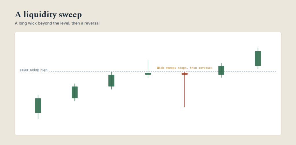
The resting orders sitting above a recent swing high, mostly stop-losses from short sellers and breakout buyers, are usually called buyside liquidity. The resting orders sitting below a recent swing low, stop-losses from long holders and breakout sellers, are called sellside liquidity. When price spikes into one of these zones and sharply reverses, that’s often described as a liquidity sweep or a stop hunt in modern terminology, and simply a false breakout or a trap in older material, all describing the same behavior.
A related pattern worth watching for: two swing highs that sit at nearly identical prices are often referred to as equal highs, and they tend to attract exactly this kind of sweep, since the resting buyside liquidity above two matching highs is a larger, more obvious pool than above a single, unique high. The same applies to equal lows on the sellside.
This matters for structure reading because a swing point formed by a long, sharp wick is a weaker, more suspect reference point than one formed by a clean, decisive close. When you’re identifying the swing high or swing low that a break-of-structure or change-of-character signal depends on, a wick-heavy spike deserves more scrutiny than a level formed by orderly, sustained price action.
Fair value gaps: the imbalance price often comes back for
A displacement candle, the unusually large, decisive candle mentioned above, often leaves behind a specific visible footprint: a gap between the wick of the candle before it and the wick of the candle after it, a three-candle range where no trading actually occurred at all. This is commonly called a fair value gap, or FVG, and it’s treated as a zone of imbalance, price moved so quickly through that area that it never gave the market a chance to trade there properly.
The common observation is that price frequently returns to partially or fully retrace through a fair value gap before continuing in the original direction, treating it as an area of unfinished business rather than a settled price. This isn’t a guarantee, plenty of fair value gaps never get filled at all, especially in a strong, fast-moving trend, but when a pullback does occur, the fair value gap left behind by the original displacement is a common area traders watch for the pullback to find support or resistance.
It’s worth being precise about what this concept adds and doesn’t add: a fair value gap identifies a specific price zone worth watching, not an independent trade signal on its own. Combined with the broader structure, a fair value gap sitting inside a discount zone during an intact uptrend carries more weight than the same gap appearing with no structural context behind it.
Reading structure across multiple timeframes
Structure on a 15-minute chart and structure on a daily chart frequently disagree, and that disagreement is informative rather than a problem to eliminate.
A practical approach: establish the broader trend on a higher timeframe, daily or 4-hour, first. That’s your directional bias. Then drop to a lower timeframe, 1-hour or 15-minute, to time entries using that timeframe’s own structure, ideally taking trades that align with the higher timeframe’s direction rather than against it.
A change of character on a 15-minute chart that runs counter to a strong, intact daily uptrend is a much lower-conviction signal than the same change of character appearing after the daily structure has already started showing its own signs of weakening. The lower timeframe gives you precision. The higher timeframe gives you context. Reading either one in isolation from the other is a common way beginners get faked out by short-term noise that never actually threatened the larger trend.
Premium and discount: where inside the structure to actually enter
Confirming the trend is only half the job. The other half is deciding where, within that structure, an entry actually makes sense, and this is where the concept of premium and discount zones is useful.
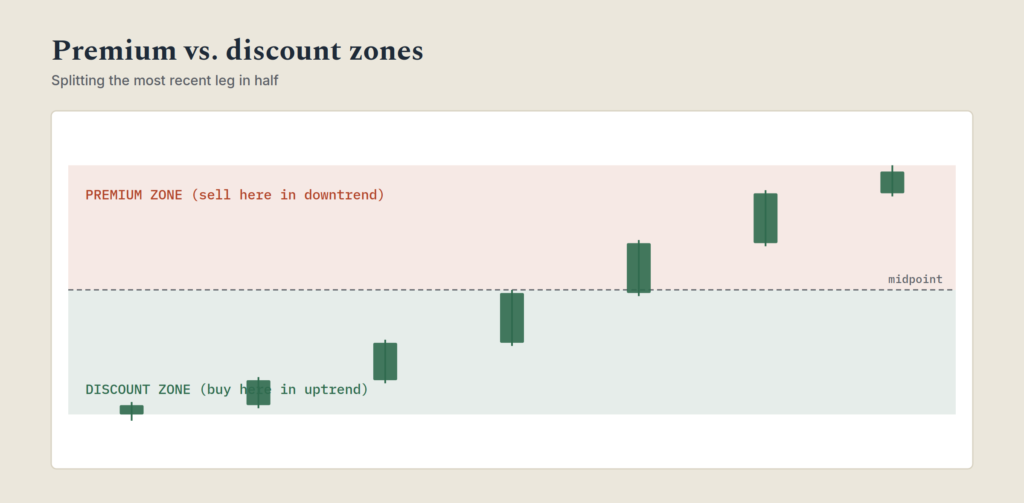
Take the most recent leg of a trend, the move from the last significant swing low to the most recent swing high in an uptrend, for example. The midpoint of that range splits it into two halves. The lower half, closer to the swing low, is the discount zone, comparatively underpriced relative to the recent range. The upper half, closer to the swing high, is the premium zone, comparatively overpriced relative to the same range.
In an intact uptrend, the higher-probability entries sit in the discount zone, buying a pullback that hasn’t given back more than half of the prior move, rather than chasing price after it’s already deep into the premium zone of its recent range. The reverse applies in a downtrend: the discount zone for sellers is the premium zone for buyers, and rallies that stall out in the upper half of the recent range are the higher-probability spots to look for shorts.
This isn’t a separate system from everything covered above, it’s a refinement. Structure tells you the direction. Premium and discount zones tell you whether the current price, within that structure, is a reasonable place to actually enter or a spot that’s already run too far to offer a favorable risk-to-reward.
Order blocks, the last opposing candle before a strong displacement move, are a related, more specific refinement worth exploring separately, and are covered in depth elsewhere on this site.
Does this actually work? An honest look
Worth being direct about something most explanations of market structure skip: this is a descriptive framework, not a predictive one with a fixed, quotable win rate. Unlike a named chart pattern that researchers have studied across thousands of historical examples, “market structure” describes a way of reading price, not a specific, countable setup with a single measurable success rate. Anyone citing a precise win rate for market structure trading in general is presenting more certainty than the concept actually offers.
What structure reading does provide is a consistent, objective definition of trend, replacing a subjective “does this look like it’s going up” judgment with a specific, repeatable rule anyone can apply the same way. That consistency is valuable in its own right, it’s the foundation nearly every other technical tool on this site builds on top of, from trendlines to price action reading to volume confirmation, but it’s a framework for organizing observation, not a standalone trade signal with a documented statistical edge the way a specific chart pattern can be.
The honest way to use it: as the first layer of analysis that tells you which direction to be looking for trades in, combined with the other tools already covered elsewhere, volume confirmation, price action buildup, a specific chart pattern, before an actual entry is justified.
A documented historical example
The clearest large-scale change of character in modern market history is the 2007 top. The S&P 500 closed at a record high of 1,565.15 on October 9, 2007, the highest close the index had reached at that point. What followed wasn’t an immediate collapse, it was a slower structural breakdown: the index failed to sustain new highs, broke down through its prior support, and the decline that followed ran for seventeen months, bottoming at a closing low of 676.53 on March 9, 2009, a decline of roughly 57%, the worst drawdown in US equities since the Great Depression.
The structural point worth taking from it: the top itself wasn’t obvious in real time. What became visible over the following weeks was a market that had stopped making sustained new highs and then broke down through levels that had reliably held throughout the preceding bull run, the exact change-of-character sequence described earlier in this article, just playing out across months on a major index instead of days on a single stock. It took the index more than five years, until March 2013, to close above that October 2007 high again.
[Embed: Structure Check interactive drill]
A walkthrough, start to finish
Here’s a hypothetical sequence on a daily chart, showing a confirmed uptrend transitioning through a change of character.
| Day | Price action | Structure read |
|---|---|---|
| 1-6 | Rallies from $80 to $92, pulls back to $87 | Higher high, higher low forming; uptrend intact |
| 7-12 | Rallies to $98, pulls back to $91 | Another higher high, higher low; uptrend continuing (break of structure) |
| 13-18 | Rallies to $95, fails to exceed $98 | Failure to make a new high; first warning sign |
| 19-22 | Price declines and breaks below $91, the prior swing low | Change of character confirmed; uptrend structure invalidated |
| 23-27 | Price continues lower, makes a new low below $87, fails to reclaim $95 on the bounce | Downtrend structure now establishing: lower low, lower high |
The actual signal isn’t day 13, when the rally merely falls short of $98. It’s day 19-22, when price breaks the $91 swing low that had been holding throughout the entire uptrend. That break is what turns “the rally is looking tired” into “the uptrend’s defining structure has actually failed.”
Common mistakes
Calling a change of character too early. A single failed high, on its own, isn’t confirmation of anything. The break below the prior swing low is what confirms it. Acting on the failed high alone means trading on a hypothesis, not a signal.
Ignoring which timeframe the structure belongs to. A change of character on a short timeframe inside an otherwise healthy higher-timeframe trend is common, normal, and frequently just noise. Treating every lower-timeframe wobble as a full reversal is a fast way to get whipsawed.
Treating every swing point as equally valid. A swing high or low formed by a long, sharp wick carries less weight than one formed by a clean, orderly close, since the wick version often reflects a liquidity sweep rather than a genuine shift in control.
Forgetting that ranges are a legitimate third state. Forcing a trending read, uptrend or downtrend, onto a market that’s actually just chopping sideways between two levels leads to false signals in both directions.
Confusing a break of structure with a change of character. One confirms the existing trend is continuing. The other warns it might be ending. Mixing the two up means reacting to continuation signals as if they were reversal signals, or vice versa.
Frequently asked questions
What’s the difference between break of structure and change of character?
A break of structure is price making a new high or low in the direction the trend is already moving, confirming continuation. A change of character is price failing to make that new high or low and then breaking the opposite way through the last significant swing point, an early signal the trend may be reversing.
Is market structure the same as trendline trading?
They’re related but distinct tools. A trendline connects swing points with a diagonal line and treats that line as a support or resistance boundary. Market structure doesn’t require drawing any line at all, it’s a direct read of the sequence of highs and lows themselves, and a trend can remain structurally intact even while price temporarily dips below a trendline drawn across it.
How many swing points do I need before I can call a trend confirmed?
There’s no fixed number, but two consecutive higher highs and higher lows (or the downtrend equivalent) is generally considered the minimum for a reasonably confirmed structural trend, since a single higher high and higher low could still just be noise inside a larger range.
Does market structure work on any timeframe?
Yes, the same logic applies from a 1-minute chart to a monthly one. What changes is significance: a change of character on a monthly chart represents a far larger shift in market conditions than the same pattern on a 5-minute chart, even though the mechanics are identical.
What is a liquidity sweep, in simple terms?
A price spike just beyond a recent high or low, usually with a long wick, that triggers resting stop-losses and breakout orders clustered at that level before reversing. Older technical analysis material describes the same behavior as a false breakout or a bull/bear trap.
What’s the difference between premium and discount zones and just buying the dip?
“Buy the dip” has no defined boundary, it can mean any pullback of any size. Premium and discount zones are more specific: they split the most recent swing leg exactly in half and treat the lower half as the higher-probability buying area in an uptrend. It’s the same underlying instinct, made objective and repeatable rather than a vague feeling about when a pullback has gone “far enough.”
Is Dow Theory still relevant, or has it been replaced by newer concepts?
The core principle, that trend is defined by the sequence of highs and lows rather than any single price level, hasn’t been replaced, it’s been relabeled. Modern terms like break of structure and change of character describe exactly the same behavior Dow wrote about in the 1890s. Learning the older framing and the newer vocabulary together makes it easier to recognize when supposedly new trading concepts are really just old ideas with a fresh coat of paint.
What is a fair value gap?
A three-candle price zone left behind by an unusually large, fast displacement candle, where no trading actually occurred. It’s treated as an area of imbalance that price sometimes returns to partially fill before continuing in its original direction, though plenty of fair value gaps are never revisited at all, particularly in strong trends.
Putting it together
None of this requires an indicator, a paid signal service, or new vocabulary to learn, if you already know Dow Theory, you already know break of structure and change of character, just under different names. What it requires is training your eye to track the actual sequence of swing highs and swing lows rather than eyeballing a chart and guessing at the trend.
Pick a stock you already follow and mark its last ten swing highs and lows on the daily chart. Note where the sequence stayed intact, where it broke, and how price behaved at the swing points formed by long wicks versus clean closes. That exercise, repeated across a handful of stocks, builds the actual skill this article describes far faster than reading about it a second time.
About the Author — Jamaluddin K.A.
Jamaluddin is the founder of The First Time Investor, a US and UK-focused personal finance and investing education site. He covers trading psychology, market mechanics, and the behavioral research behind why traders struggle with execution even when their strategy is sound.
Disclosure: This article is for educational purposes only and does not constitute financial advice. Trading involves significant risk including the potential loss of principal. Consult a licensed financial advisor before making investment decisions.