

Does price action trading actually work is a question every trader eventually asks themselves at 2am after a losing streak, wondering if the whole thing is a coin flip dressed up in candlestick patterns.
Here’s what almost nobody tells you: this question has already been answered. Not by a YouTube guru. By actual peer-reviewed academic research spanning more than 50 years, across stock markets, forex markets, and futures markets on 4 continents.
This article walks through what the research actually found, why the market moves the way it does, and which specific patterns have real statistical backing behind them.
The Academic War Over Price Action
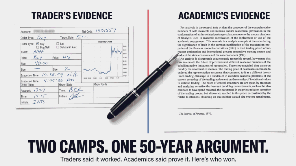
For most of the 20th century, there were two camps that fundamentally disagreed about whether price action trading works.
Camp 1: The traders. Wall Street professionals and commodity traders had used price patterns to make trading decisions for decades. Survey after survey confirmed it. A 1965 survey of commodity traders found over half used technical analysis. A 1994 survey found roughly 60% relied on it exclusively. Multiple surveys between 1997 and 2003 found 30-40% of foreign exchange traders believed technical analysis could predict currency movements up to 6 months out.
Camp 2: The academics. In 1970, economist Eugene Fama published his Efficient Market Hypothesis in The Journal of Finance. His argument: “it is futile to attempt to make profits by exploiting currently available information such as past price trends.” The theory holds that all available information, including historical prices, gets instantly reflected in the current price. If that’s true, past price patterns tell you nothing useful about future prices.
Fama’s hypothesis was backed by real evidence. Studies by Fama and Blume in 1966, and by Van Horne and Parker in 1967 and 1968, tested price action strategies against simple buy-and-hold across 30 securities. Only 3 strategies beat the market. Factor in brokerage fees, and even those 3 came out even or worse than just buying and holding.
Case closed, right? Not quite.
The Discovery That Cracked the Efficient Market Hypothesis
Here’s where it gets interesting.
Professor Dr. C. Irwin published a meta-analysis in 2007 examining 95 separate studies on the effectiveness of price action trading. His finding contradicted the neat conclusion academics had settled on decades earlier.
Early studies, Irwin found, showed technical trading strategies were profitable in foreign exchange markets and futures markets just not in stock markets. This made no logical sense to economists at the time, since forex and futures markets were supposed to be more liquid and more efficient than stock markets, not less.
In 1972, researcher Leuthold tested price action strategies in live cattle futures and found an annual net return of 115.8% after accounting for brokerage fees and spread. Irwin identified 7 additional studies between 1965 and 1986 that found substantial net profits using price action in forex and futures markets.
So why had earlier studies dismissed the stock market results? Irwin found 4 fundamental flaws in the original academic research:
- They tested too few strategies. Most early studies tested only 1 or 2 trading systems often the ones traders already knew didn’t work well.
- No statistical significance testing. There was no rigorous proof that the “efficient market” results were even statistically meaningful.
- No risk control. Risk management is the foundation of any real trading strategy. Early studies ignored it entirely.
- Reporting only averages. If technical analysis worked in some cases and failed in others, reporting only the average masks the cases where it actually worked.
Once modern researchers corrected these flaws, the picture changed dramatically. Of 95 modern studies reviewed in Irwin’s meta-analysis, 56 found positive results for technical trading strategies, 20 found negative results, and 19 found mixed results.
Nearly 60% of rigorous modern research supports price action trading working, at least in specific, testable forms.
Real-World Proof the Market Isn’t Perfectly Efficient
Beyond academic studies, real market events have repeatedly demonstrated that markets don’t behave with perfect efficiency.
The Zoom ticker confusion. When Zoom Video Communications went public in 2019, investors looking to buy shares under the expected “ZOOM” ticker accidentally bought shares of an unrelated company, Zoom Technologies, which happened to hold that ticker. The mix-up sent Zoom Technologies shares up 70,000%. A perfectly efficient market, by definition, shouldn’t allow a ticker symbol mix-up to move a stock price by that magnitude.
The Blackstone conversion. When Blackstone Group converted from a publicly traded partnership to a corporation, the change meant the company would pay more in taxes and post lower net profits. Shares still jumped on the announcement because the corporate structure allowed institutional index funds to buy shares they previously couldn’t hold as a partnership. Pure structural technicality moved price, not fundamentals.
The GameStop short squeeze. Coordinated retail buying on social media drove GameStop’s price up dramatically in early 2021, inflicting massive losses on short-sellers who had bet the stock would fall. This is about as clear a demonstration of market inefficiency driven by collective human behavior as modern markets have produced.
None of these events happened because of changing fundamentals. They happened because of information asymmetry, structural rules, and collective psychology exactly the kinds of forces that price action trading is designed to capture.
Why the Market Moves the Way It Does
Understanding why price action works requires understanding what’s actually happening behind every price tick.
Think of the 1906 county fair experiment by statistician Francis Galton. Eight hundred people were asked to guess the weight of an ox. No individual guessed correctly. But the average of all 800 guesses came within 0.1% of the ox’s actual weight.
The stock market works the same way. Every price on a chart is the collective belief of every market participant, expressed through buying and selling. When good news arrives, more people want to buy, so price rises. When bad news arrives, more people want to sell, so price falls. Every article, every earnings report, every economic data release, every rumor gets absorbed into that single number: the current price.
But this alone doesn’t explain the sharp, seemingly random thrashing you see on any intraday chart the sudden spikes and reversals that happen even without any news catalyst.
That behavior comes from market makers.
The Market Maker Mechanism
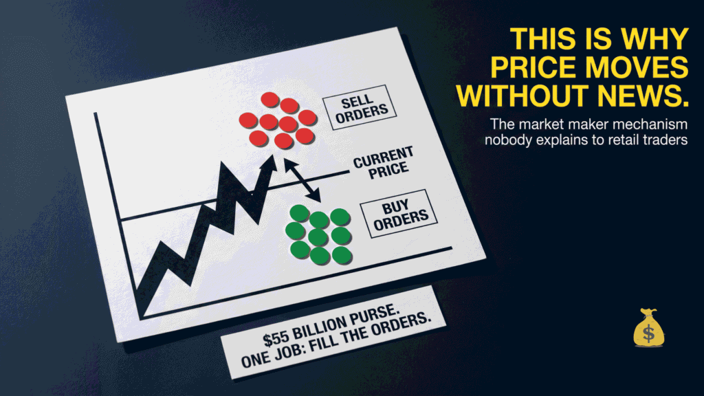
Every liquid market has market makers whose job is to fill orders regardless of overall trend direction. Clients place buy and sell orders through dealers. Dealers pass them to market makers, who use their own capital to fill those orders pushing price toward wherever the concentration of unfilled orders sits.
Picture a chart with clusters of pending sell orders sitting above the current price and clusters of pending buy orders sitting below it. The market maker will deliberately push price up toward the sell order cluster to fill those orders while simultaneously placing their own opposing orders, since they expect price to reverse afterward. Then they push price down toward the buy order cluster to fill those, and the cycle repeats.
For a major currency pair like GBPUSD, the total capital market makers deploy for this purpose has historically been estimated around $55 billion. When that capital gets spent on one directional push, it typically produces a price move of roughly 55 pips before pausing. This is why price often moves in discrete bursts rather than smooth continuous lines and why patterns tend to repeat at similar magnitudes within the same instrument.
This mechanism is not manipulation in the illegal sense. It’s the structural function that keeps markets liquid. But understanding it reframes what a chart pattern actually represents: not random noise, but the visible footprint of order flow being filled in a repeatable, structurally-driven way.
The 3 Steps Every Price Action Strategy Follows
Every successful price action strategy, regardless of which specific patterns it uses, follows the same 3-step structure:
Step 1: Direction. Where is price likely headed? This uses directional patterns chart formations that have been tested to show statistically reliable continuation after they complete.
Step 2: Entry signal. When exactly should you enter? This uses shorter-term candlestick or bar patterns that confirm the directional move is beginning right now, not just “at some point.”
Step 3: Exit levels. When do you take profit, and when do you cut losses? This determines your actual risk-to-reward ratio on the trade.
Get any one of these 3 wrong, and the strategy falls apart regardless of how good the other two are. Most beginner traders focus heavily on Step 1 and barely think about Steps 2 and 3 which is backwards, since exit discipline is what actually determines long-term profitability.
The Scientifically Tested Directional Patterns
The most rigorous study on directional pattern reliability came from Dr. Friesen and colleagues in 2009, who examined 35,000 trading scenarios involving double top/bottom and head and shoulders patterns.
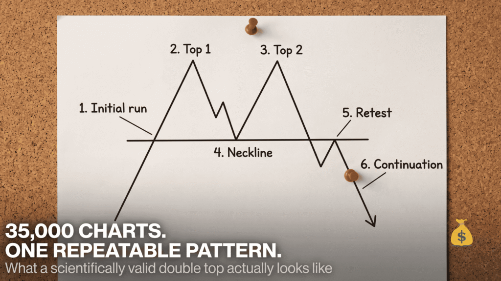
Their finding: when a pattern met strict validity criteria, price continued in the expected direction for an average of 100 days afterward.
Table 1: The 6 Stages of a Scientifically Valid Double Top/Bottom
| Stage | What Happens |
|---|---|
| 1. Initial run | Price moves strongly in one direction before the pattern begins |
| 2. First reversal (Top/Bottom 1) | Price reverses at a specific level for the first time |
| 3. Second reversal (Top/Bottom 2) | Price returns to approximately the same level and reverses again |
| 4. Neckline formation | The low (for tops) or high (for bottoms) between the two reversals creates a reference line |
| 5. Retest | Price breaks the neckline, then returns to retest it before continuing |
| 6. Continuation | Price moves in the new direction, averaging 100 days of continuation in the study |
The important caveat: this is an average path across 35,000 scenarios, not a guarantee for any individual trade. Think of it like a compass rather than GPS turn-by-turn directions it tells you the general direction to expect, but real price movement will still have pullbacks, false starts, and noise along the way.
Table 2: Other Scientifically Studied Directional Patterns
| Pattern | Typical Signal |
|---|---|
| Double tops and bottoms | Reversal after two failed attempts at a level |
| Head and shoulders | Reversal after three peaks, middle one highest (or lowest for inverse) |
| Cup and handle | Continuation pattern after a rounded consolidation |
| Channels | Continuation within parallel trend lines |
| Ascending and descending wedges | Reversal or continuation depending on prior trend direction |
| Broadening tops/bottoms | Increasing volatility often preceding a larger move |
The research consensus on how many patterns to actually use: fewer is better. Traders who focus on mastering 1-2 patterns consistently outperform those trying to track all of them simultaneously. Recognition speed and pattern reliability both improve dramatically with focused repetition rather than broad but shallow familiarity.
The Scientifically Tested Entry Signals
Knowing the likely direction isn’t enough. You need to know exactly when to enter.
The first rigorous testing of short-term entry patterns was conducted between 1992 and 1996 by researchers Caginalp and Laurent at the University of Pittsburgh, examining every stock in the S&P 500 over that period.
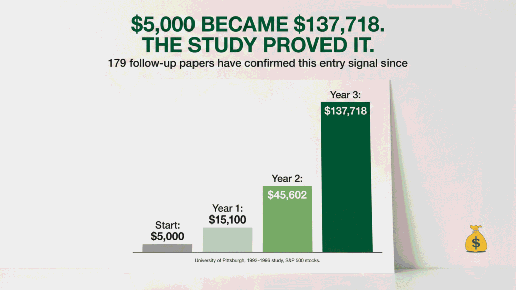
Their published conclusion: “a trader who has the same information as others plus the knowledge of this method will have a competitive advantage.” Their measured returns compounded capital to between 202% and 259% of the initial investment annually.
Table 3: Hypothetical Growth of $5,000 at Documented Study Returns
| Time Period | Portfolio Value |
|---|---|
| Start | $5,000 |
| After 1 year | $15,100 |
| After 2 years | $45,602 |
| After 3 years | $137,718 |
These are the study’s documented compounding results, not a guarantee of future performance. But the study didn’t stand alone. It sparked what researchers call one of the most heavily replicated findings in trading research 179 follow-up papers have referenced the original study.
Researchers Shiu and Lu tested the same entry-signal methodology in the Taiwan stock market from 1998 to 2007 and confirmed the results, writing that the strategy was “more frequent and most trustworthy” compared to alternatives they tested. Subsequent studies replicated the finding in the Malaysian stock market (2018), the Vietnamese stock market (2018), and the Indian stock market 3 entirely separate markets, 3 separate research teams, consistent results.
What the Actual Entry Signal Looks Like
The core validated pattern is a 3-bar sequence: a narrow-range candle (representing built-up energy from a tight consolidation), followed by an engulfing candle that completely swallows the previous candle’s range, followed by a confirmation candle that breaks the engulfing candle’s extreme.
The logic behind why it works ties directly back to the market maker mechanism covered earlier. The narrow-range candle represents price being compressed into a tight zone while orders accumulate. The engulfing candle is what happens when the market maker fills a cluster of orders and price shoots through in one direction. The confirmation candle validates that the move is continuing rather than immediately reversing.
Many experienced traders don’t even wait for the third confirmation candle they enter on the engulfing candle itself once the directional pattern and entry signal align, since waiting for full confirmation sacrifices some of the available move.
The 3 Psychological Traps That Undermine Good Strategies
Even a strategy with genuine statistical backing fails in practice if the trader falls into these common behavioral traps.
Complexity bias. The belief that something must be superior simply because it’s more complicated. Many traders dismiss genuinely well-tested, simple patterns like double tops and bottoms because they seem “too basic” to be effective then chase increasingly complex systems that have far less research behind them. Simplicity and statistical validity are not mutually exclusive.
Novelty bias. Also called shiny object syndrome being drawn to new strategies simply because they’re unfamiliar, even when a proven approach works just as well or better. This drives the pattern of strategy-hopping: abandoning a profitable approach before it’s had enough trades to prove itself, then jumping to the next trend.
Lack of commitment. Traders who keep “one foot in and one foot out” of any given strategy never accumulate enough trades to know whether it’s actually working. A strategy needs a meaningful sample size typically 100+ trades before its true win rate and risk-reward profile become statistically visible. Abandoning it after 10 losing trades tells you nothing reliable.
The traders who succeed long-term generally share one trait: full commitment to a tested methodology for long enough to gather real statistical evidence about its performance, rather than emotional reactions to short-term results.
Frequently Asked Questions
Does price action trading actually work according to science?
Yes, according to a significant body of peer-reviewed research. A 2007 meta-analysis of 95 studies found 56 with positive results supporting technical trading strategies, 20 with negative results, and 19 mixed. Early studies from the 1960s that dismissed price action had methodological flaws, including testing too few strategies and ignoring risk management. Once these were corrected in later research, technical analysis showed statistically significant profitability, particularly in forex and futures markets.
What is the Efficient Market Hypothesis and does it disprove price action trading?
The Efficient Market Hypothesis, proposed by Eugene Fama in 1970, argues that all available information, including past prices, is instantly reflected in current prices, making it impossible to profit from historical patterns. While early research supported this in stock markets, subsequent studies found technical analysis was profitable in forex and futures markets, and later corrected stock market studies also found positive results. The hypothesis is not universally disproven, but it does not hold as absolutely as originally claimed.
What are the most scientifically validated chart patterns?
Double tops, double bottoms, and head and shoulders patterns have the strongest academic backing, based on a 2009 study examining 35,000 trading scenarios. When these patterns meet strict validity criteria (a clear initial run, two or three distinct reversal points, a neckline, and a retest), price continued in the expected direction for an average of 100 days in the study.
How reliable is the 3-bar entry signal pattern?
The narrow-range candle followed by an engulfing candle and confirmation candle pattern has been tested and replicated across at least 5 separate stock markets (US, Taiwan, Malaysia, Vietnam, and India) by different research teams between 1996 and 2018. The original University of Pittsburgh study found annual compounding returns between 202% and 259% using this method on S&P 500 stocks, and 179 subsequent papers have referenced or built on the original findings.
Why does the market sometimes move without any news?
Market makers are obligated to fill client buy and sell orders regardless of overall market direction. They push price toward clusters of pending orders to fill them, which can create sharp, seemingly random price movements even without any news catalyst. This order-filling mechanism explains much of the short-term “noise” traders see on intraday charts, separate from the longer-term price movements driven by actual news and fundamentals.
What’s the biggest mistake traders make even when using a proven strategy?
Abandoning the strategy before gathering enough trades to know if it’s actually working. Complexity bias (assuming simple strategies must be inferior) and novelty bias (chasing new strategies for the sake of novelty) both lead to strategy-hopping, which prevents any single approach from accumulating the 100+ trade sample size typically needed to reveal its true statistical performance.
About the Author — Jamaluddin K.A.
Jamaluddin is the founder of The First Time Investor, a US and UK-focused personal finance and investing education site. He covers trading strategy, market mechanics, and the research behind technical analysis for traders who want evidence-based methods rather than guesswork.
Disclosure: This article is for educational purposes only and does not constitute financial advice. Trading involves significant risk including the potential loss of principal. Past study results do not guarantee future performance. Consult a licensed financial advisor before making investment decisions.