
Quick answer
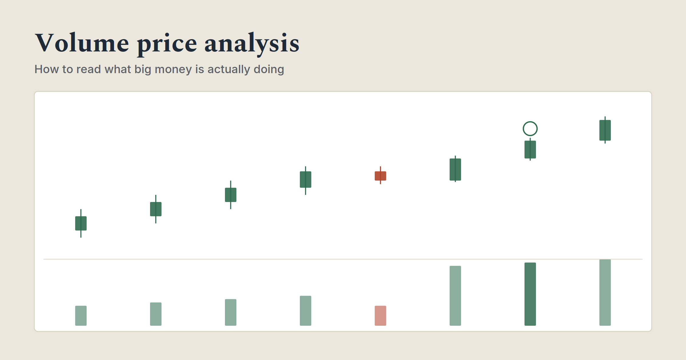
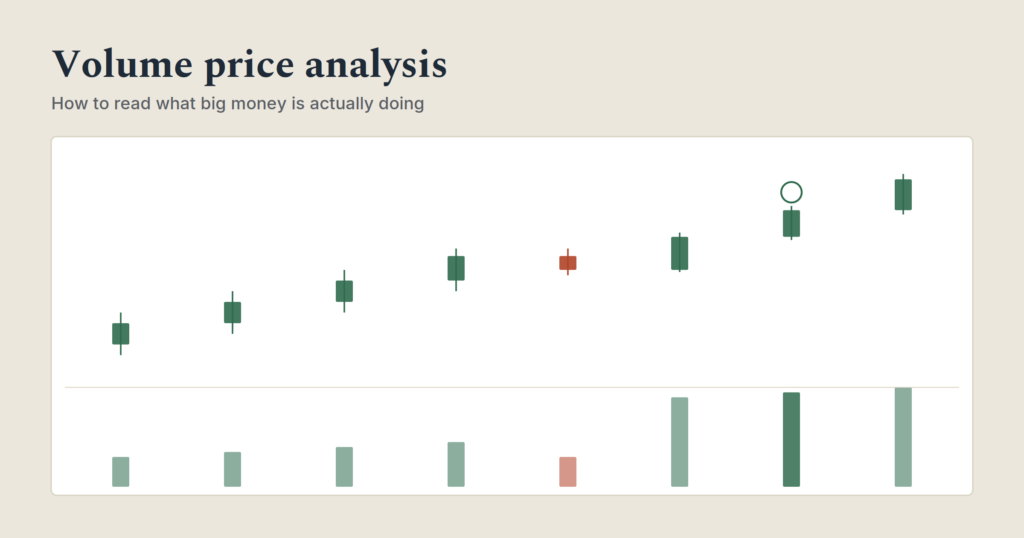
Volume price analysis (VPA) reads volume alongside price to judge whether large market participants are actually behind a move or sitting it out. The core test is agreement: big volume should produce a big price move, and a small price move on big volume, or a big move on tiny volume, is a red flag worth investigating before it’s a signal worth trading.
| Situation | Volume | Price move | What it usually means |
|---|---|---|---|
| Agreement, bullish | High | Large, upward | Real buying, likely genuine |
| Agreement, bearish | High | Large, downward | Real selling, likely genuine |
| Disagreement | High | Small | Effort without result, someone is absorbing the move |
| Disagreement | Low | Large | Thin market, easy to move, treat with suspicion |
| Quiet | Low | Small | Little interest either way |
Most beginners read a chart as a story about price alone: it went up, it went down, here’s a line marking where it turned. Volume price analysis adds the other half of the story. Price tells you what happened. Volume tells you how much conviction was actually behind it, and conviction is what separates a move worth following from one worth ignoring.
The core idea: volume reveals who’s actually behind a move
The premise behind VPA is simple: large market participants can’t hide their footprint the way they can hide their identity. A fund or a large trader moving serious size into or out of a stock shows up in volume, whether or not the price move looks dramatic. A thin, easily-pushed stock can be moved a long way on very little actual participation, which is exactly the kind of move that tends to reverse once the pushing stops.
That gives you a genuinely useful filter: does the volume behind a price move look proportionate to the move itself? When it does, the move has real participation behind it. When it doesn’t, something worth investigating is going on, either accumulation or distribution happening quietly, or a move that’s more show than substance.
Wyckoff’s three laws, in plain English
Much of this approach traces back to Richard Wyckoff, an early 20th-century trader who studied the relationship between price and volume long before charting software existed. Three principles from that era still hold up.
| Law | What it says | What to check |
|---|---|---|
| Supply and demand | When supply outweighs demand, price falls. When demand outweighs supply, price rises. | The most basic law, but worth remembering every other concept here is just a more precise way of reading this |
| Effort and result | Volume (the effort) should match the size of the price move (the result). | Does a big-volume day actually produce a big price move, or does it fizzle? |
| Cause and effect | A longer buildup phase should produce a longer, larger move once it resolves. | How long has the stock been building up at this level before the current move? |
The second law, effort and result, is the one that does most of the practical work day to day. It’s the direct ancestor of the “buildup before a breakout” idea covered in price action trading more broadly, just viewed through volume specifically instead of candle shape alone.
Reading effort vs result
This is the actual skill, and it comes down to checking whether volume and price agree.
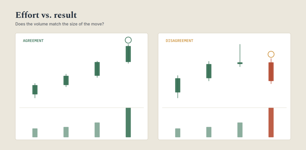
Agreement is the simple case. High volume accompanying a large price move in the same direction confirms real participation. Low volume accompanying a small, indecisive move confirms genuine lack of interest, nothing wrong, just nothing happening.
Disagreement is where the useful information lives. High volume with a disappointingly small price move is effort without result, a sign that whatever buying or selling is happening is being absorbed by the other side rather than actually moving the market. A large price move on unusually low volume is the opposite problem: the move looks dramatic, but there’s little actual participation behind it, which makes it a lot easier to reverse than a heavier-volume move would be.
A practical habit: every time you see an unusually large volume bar, check what the price actually did in response before assuming the move means what it looks like it means. A big up day on huge volume that only closes marginally higher than it opened is telling you something different than a big up day on huge volume that closes near its high.
Effort vs result
1 / 4Each scenario shows a day’s volume next to what price actually did. Decide: does the effort match the result?
The third variable: spread, not just volume and direction
Volume and price direction are the two variables most beginners check. VPA adds a third: spread, meaning how wide the candle's high-to-low range actually is, and where it closes within that range.
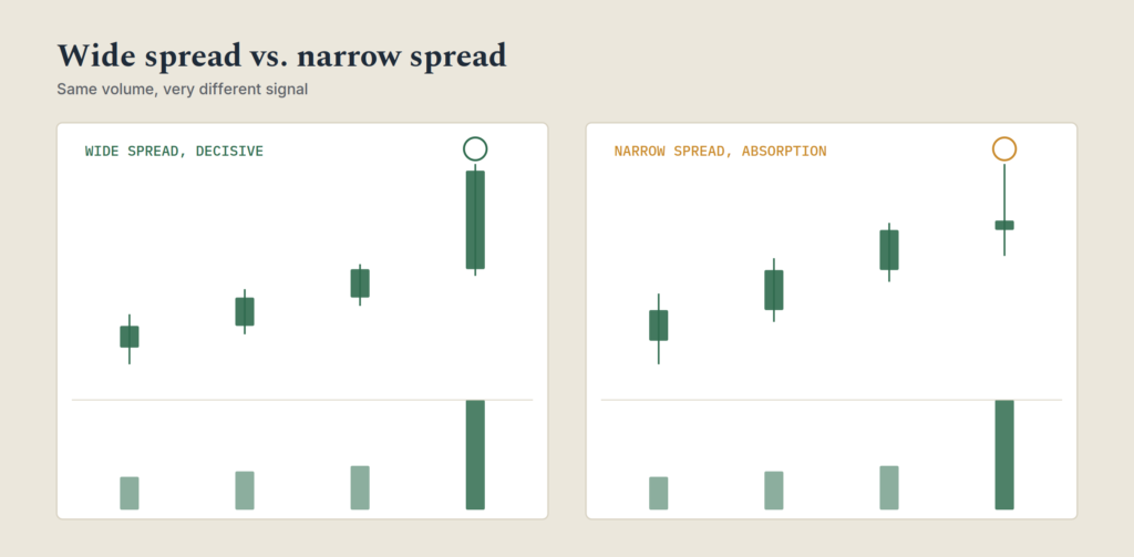
A wide spread candle, a large range from high to low, paired with high volume and a close near the top or bottom of that range, is a strong, decisive signal in whichever direction it closes. The market moved a long way and settled near the extreme, meaning whichever side was pushing kept control through the close.
A narrow spread candle on high volume is the more interesting case, and it's often missed. A lot of volume traded, but the price barely moved anywhere, and often closed in the middle of a tight range. That combination, heavy volume with a tight, indecisive spread, is frequently a sign of absorption: one side is actively being met and neutralized by the other, right at that price level. Seeing this near a resistance level suggests supply is soaking up demand. Seeing it near a support level suggests demand is soaking up supply.
Reading all three together, volume, spread, and where the close sits within the spread, gives a fuller picture than any single one alone. A wide spread candle on low volume is suspect, since there wasn't much real participation behind a supposedly big move. A narrow spread candle on low volume is simply quiet, unremarkable, and usually not worth much attention. It's the combination of a strong reading on one variable against a weak reading on another that tends to flag the moments worth a closer look.
Selling climax and buying climax: the confusing part
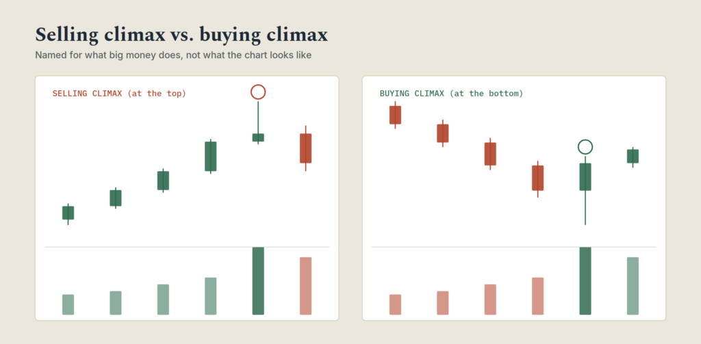
This is the part beginners most often get backwards, so it's worth being precise. In this framework, a "selling climax" happens at the top of a strong rally, not the bottom of a decline, because it describes large holders selling into strength while price is still rising. A "buying climax" happens at the bottom of a decline, when large holders are buying up shares from panicking sellers, not at the top.
The naming describes what the big money is doing, not what the price chart looks like at that moment, which is exactly why it trips people up.
| Climax type | Happens where on the chart | What's really going on | What retail traders tend to do |
|---|---|---|---|
| Selling climax | Top of a strong rally | Large holders sell into euphoric buying, on high volume and volatile price action | Buy in late, driven by fear of missing out |
| Buying climax | Bottom of a sharp decline | Large holders buy up shares from panicked sellers, on high volume and volatile price action | Sell out in a panic, near the actual bottom |
This also explains a pattern worth internalizing: markets tend to fall faster than they rise. Accumulation, building a position quietly, takes time and patience, since buying too aggressively pushes the price up before the position is complete. Distribution at the top can afford to be patient too, but the actual decline that follows, once large holders are done selling and stop supporting the price, tends to happen quickly, since there's no one left with a reason to buy support back in.
Tests: how a level gets confirmed before the real move starts
Before a new trend actually gets underway, there's usually a test, a deliberate check to confirm the opposing pressure has genuinely been absorbed.
A test of supply happens near the end of an accumulation phase. Price is pushed down slightly, and if there's little response, closing back near the open on low volume, that confirms sellers have largely been cleared out and the move higher can proceed without much resistance.
A test of demand happens near the end of a distribution phase. Price is pushed up slightly, and if buyers don't show up in size, closing back near the open on low volume, that confirms the move lower can proceed without much buying pressure in the way.
The volume on the test is the whole signal. A test on high volume suggests the opposing side is still present and the move isn't ready yet. A test on low volume suggests the coast is genuinely clear.
Why congestion matters more than beginners think
Markets spend a large majority of their time moving sideways in a range, not trending. That congestion isn't wasted time on the chart, it's where the next move actually gets built.
These sideways stretches are where accumulation or distribution happens quietly, out of sight of anyone only watching for a trend. A stock chopping in a tight range for weeks isn't necessarily doing nothing. It may be exactly where a future move is being prepared, and the volume pattern during that congestion, quietly building, spiking on tests, tells you more about what's coming than the price range itself does.
This is also why breakout trading gets a bad reputation among traders who ignore volume entirely. A breakout from congestion on strong, confirming volume is a very different animal than the same breakout on weak volume, even though the price chart looks identical in both cases at the moment it happens.
The volume point of control: a different kind of support and resistance
Most beginners think about support and resistance purely in terms of price levels where a chart has previously turned. Volume price analysis adds a second version of the same idea: instead of plotting where price has turned, plot how much volume has actually traded at each price level.
The price level with the heaviest concentration of traded volume is sometimes called the volume point of control, roughly, the price the market has spent the most time agreeing is fair value. Price levels with unusually low traded volume tend to get moved through quickly if revisited, since there wasn't much disagreement transacted there in the first place. Price levels with unusually high traded volume tend to cause a pause if revisited, since a lot of positions were built or exited there and the market tends to react around that memory.
This gives you a second lens for support and resistance, one based on where money actually changed hands rather than only where the price visually turned.
Two real climaxes, and what actually happened next
Textbook explanations make climaxes sound tidy: huge volume, then a clean reversal. Real markets are messier, and looking at two actual events shows why the volume spike itself is a warning to pay attention, not a precise buy or sell signal on its own.
In March 2020, as COVID-driven selling accelerated, the S&P 500 ETF (SPY) saw volume spike to roughly 6.5 times its average as the decline picked up speed. That wasn't the bottom. It was closer to the start of the sharpest leg of the drop, with more selling still to come before the market actually turned in late March. A trader treating that spike alone as "the climax, buy now" would have been early and painful.
Contrast that with the Alternative Harvest ETF (MJ), a cannabis-sector fund that reportedly peaked on volume around 32 times its typical average in 2018, right before a sustained, multi-year decline. In that case, the extreme volume did mark the top almost exactly.
Same underlying concept, two very different outcomes. The lesson isn't that volume climaxes don't work, it's that a climax signals exhaustion of the prevailing psychological extreme, euphoria or panic, not a guaranteed pivot on the exact bar it occurs. Some climaxes need a second wave, a retest, or several more days to actually complete. Treating the first big volume bar as gospel, rather than as the start of a phase that still needs a test to confirm, is a common way this gets misapplied.
A free tool most beginners already have and never use
Every platform pushing a paid volume tool wants you to believe you need to buy something to see this clearly. Most retail traders already have a free version sitting inside a platform they're already using and have simply never turned it on.
TradingView, one of the most widely used free charting platforms, has a built-in Volume Profile tool. Adding it to a chart overlays a horizontal histogram along the price axis showing exactly how much volume traded at each price level over whatever period you select, which is the practical version of the volume point of control idea covered above. You don't need a paid add-on or a separate platform to see this. Right-click the chart, add the indicator from the built-in list, and select a date range.
Once it's on the chart, look for two things: the single price level with the tallest bar in the histogram, roughly the fairest value the market has agreed on recently, and any noticeably thin gaps in the histogram, price levels the market moved through quickly without much trading. Price tends to revisit the tall bar and move quickly through the thin gaps, which gives you a volume-based version of support and resistance to check against the price-based levels you're already using.
A walkthrough, start to finish
Concepts land differently followed through an actual sequence. Here's a hypothetical accumulation-to-breakout cycle on a daily chart.
| Day | Price and volume | What it means |
|---|---|---|
| 1-5 | Stock chops sideways between $40 and $43 on average volume | Congestion, no clear signal yet |
| 6 | Sharp drop to $38 on very high volume, closes at $38.50 | Possible buying climax: a scare that shakes out weak holders |
| 7-10 | Stock recovers to $41-42 range, volume tapering off | Early accumulation, quiet buildup |
| 11 | Price dips to $39.80 on notably low volume, closes at $40.90 | Test of supply: sellers don't show up, low volume confirms it |
| 12-14 | Stock grinds up to $43-44, moderate rising volume | Markup phase beginning, effort and result in agreement |
| 15 | Breaks above $44 on a strong volume spike, closes near the day's high | Confirmed breakout, volume agrees with the size of the move |
The signal worth trusting isn't day 15 on its own. It's day 15 in the context of day 11's low-volume test and the steadily rising volume through days 12-14. A breakout on day 15 with no prior test and no volume buildup beforehand would be a much weaker signal, even if the candle looked identical.
How this is different from a volume indicator
Plenty of charting platforms offer volume-based indicators, On-Balance Volume, the Accumulation/Distribution line, various volume oscillators. These aren't the same thing as reading volume price analysis directly, and it's worth understanding why.
An indicator like OBV compresses volume into a single running line by adding or subtracting each day's volume based on whether the close was up or down. That's useful as a quick visual summary, but it discards information in the process, specifically the spread and where the close sits within it, both of which matter for the effort-versus-result read covered above. Two very different bars, a wide-spread trend day and a narrow-spread absorption day, can update an indicator like OBV in nearly the same way despite representing almost opposite situations underneath.
That doesn't make these indicators useless. As a quick glance to confirm a trend has broad volume support behind it, they're a reasonable shortcut. But they're a summary, not a replacement for actually looking at the volume bar next to the candle it belongs to, checking the spread, and checking where the close landed. The indicator tells you the average sentiment over time. Reading the raw volume and price together tells you what happened on the specific bar that actually matters.
Common mistakes
Treating every volume spike as significant. Volume spikes happen around earnings, news, and index rebalancing for reasons that have nothing to do with accumulation or distribution. Context matters more than the spike itself.
Ignoring the test. A breakout that skips the low-volume test phase and just appears out of nowhere deserves more skepticism, not less, even though it might look more exciting on the chart.
Confusing high volume with bullish volume. Volume is neutral. High volume on a down day is not automatically bearish and high volume on an up day is not automatically bullish, it depends entirely on whether the volume agrees with the direction and size of the move.
Forgetting that markets fall faster than they rise. Expecting a decline to unfold as slowly and patiently as the accumulation that preceded a rally is a common and costly miscalibration.
Frequently asked questions
Is volume price analysis the same as reading order flow?
They're related but not identical. Order flow looks at real-time buy and sell orders hitting the market, often used by very short-term traders. Volume price analysis works from completed bars on a chart, looking at total volume traded over a period alongside how price behaved during it, and applies equally well to longer timeframes like daily or weekly charts.
Does this work for stocks that don't have centralized volume, like forex?
For markets without a single central exchange, most platforms use tick volume, the number of price changes in a period, as a proxy for actual traded volume. It's not identical to true volume, but it's generally treated as a reasonable stand-in for VPA purposes.
How is a selling climax different from a normal high-volume up day?
Context and what follows. A normal high-volume up day in an established uptrend is often just continued participation. A selling climax specifically refers to a high-volume, volatile top after an extended rally, typically followed by a test and then a reversal, rather than continuation.
Can volume price analysis be combined with trendlines or price action reading?
Yes, and it usually strengthens both. A trendline break or a price action buildup zone that's also confirmed by volume agreement is a stronger signal than either read in isolation. None of these tools work best used alone.
Putting it together
None of this requires special software. Most charting platforms already show volume by default, most traders just don't look at it as anything more than a bar chart underneath the real chart.
Start by picking a stock you already follow and scrolling back through its last few months, marking where volume spiked and checking what price actually did in response each time. Note the quiet, low-volume tests before any breakout you can find, and the high-volume climaxes at major turning points. That kind of deliberate review, done a dozen times over, builds the pattern recognition that makes effort and result a genuinely fast read rather than a slow calculation.